Design

MFA Thesis: Low-Impact Production with Bioplastic Composites


project overview

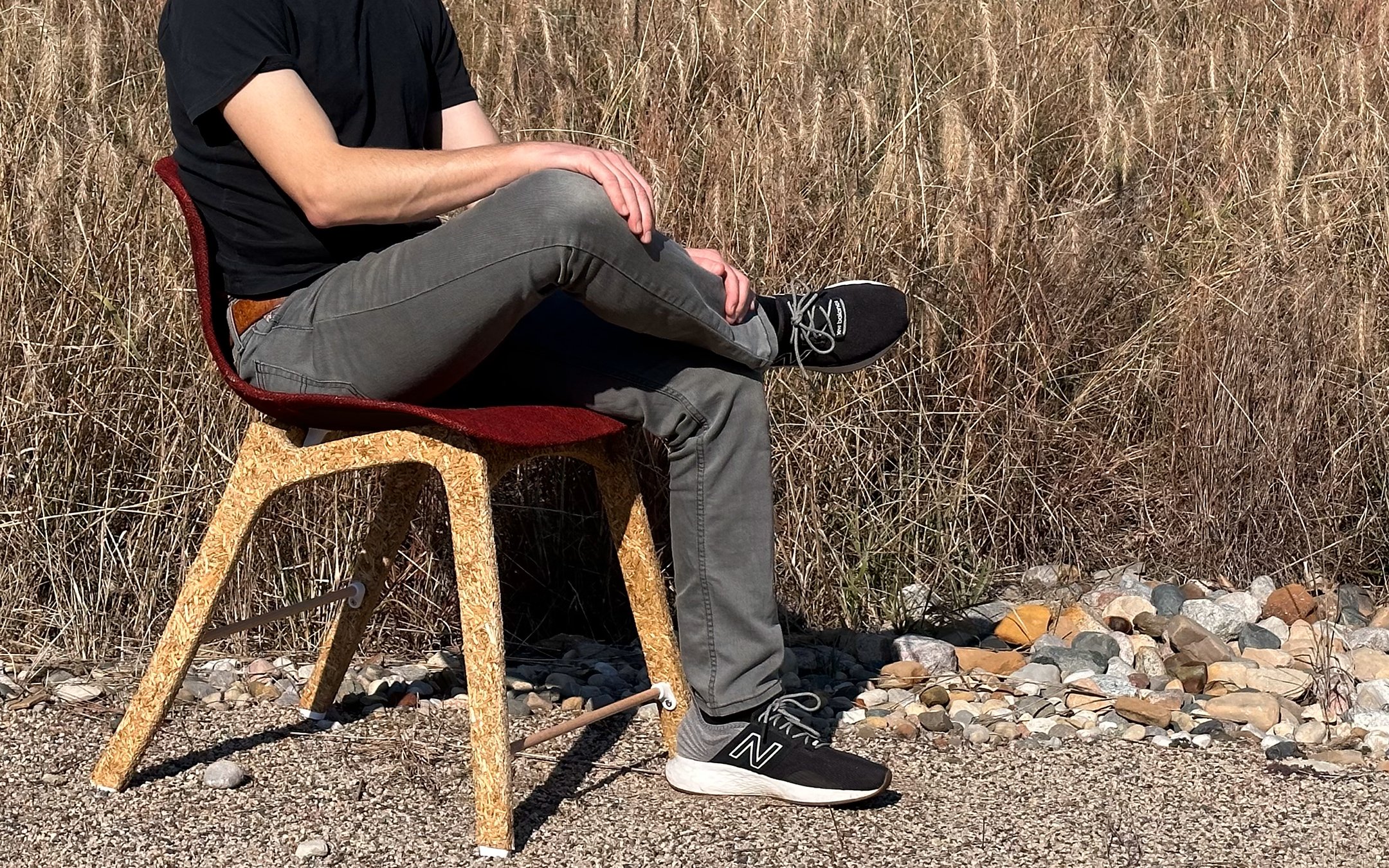
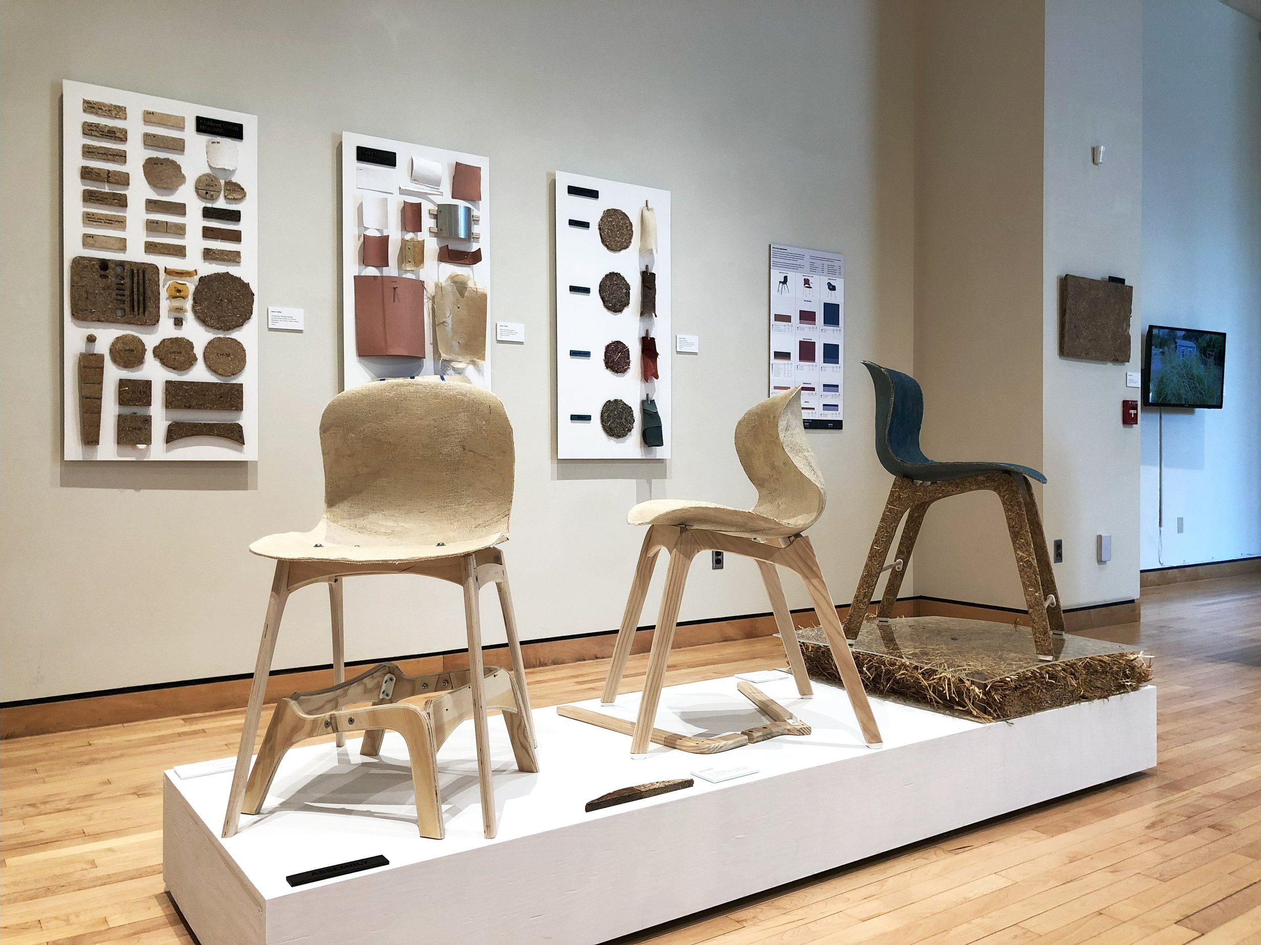
In this project, I build a chair from scratch using natural and recycled materials in a process that is as free from petroleum as possible. This was an eight-month project performed for my 2023 MFA Thesis Exhibition at the University of Notre Dame.

This project proposes a low-impact model of production and uses renewable, locally sourced bio-composites. Many of our furnishings and modern building materials are designed to be made in high volume and as cheaply as possible. This has led to an endless flow of petroleum-derived plastics, epoxy-soaked timber, and toxic adhesives that are impossible to reuse or recycle. The popularity of home renovations and imported fast-furniture in our consumerist culture ensures this direct-to-landfill trend will endure. This project seeks to disrupt this cycle by re-localizing manufacturing and bringing a renewed interest in place, purpose, and materiality to a new line of products.

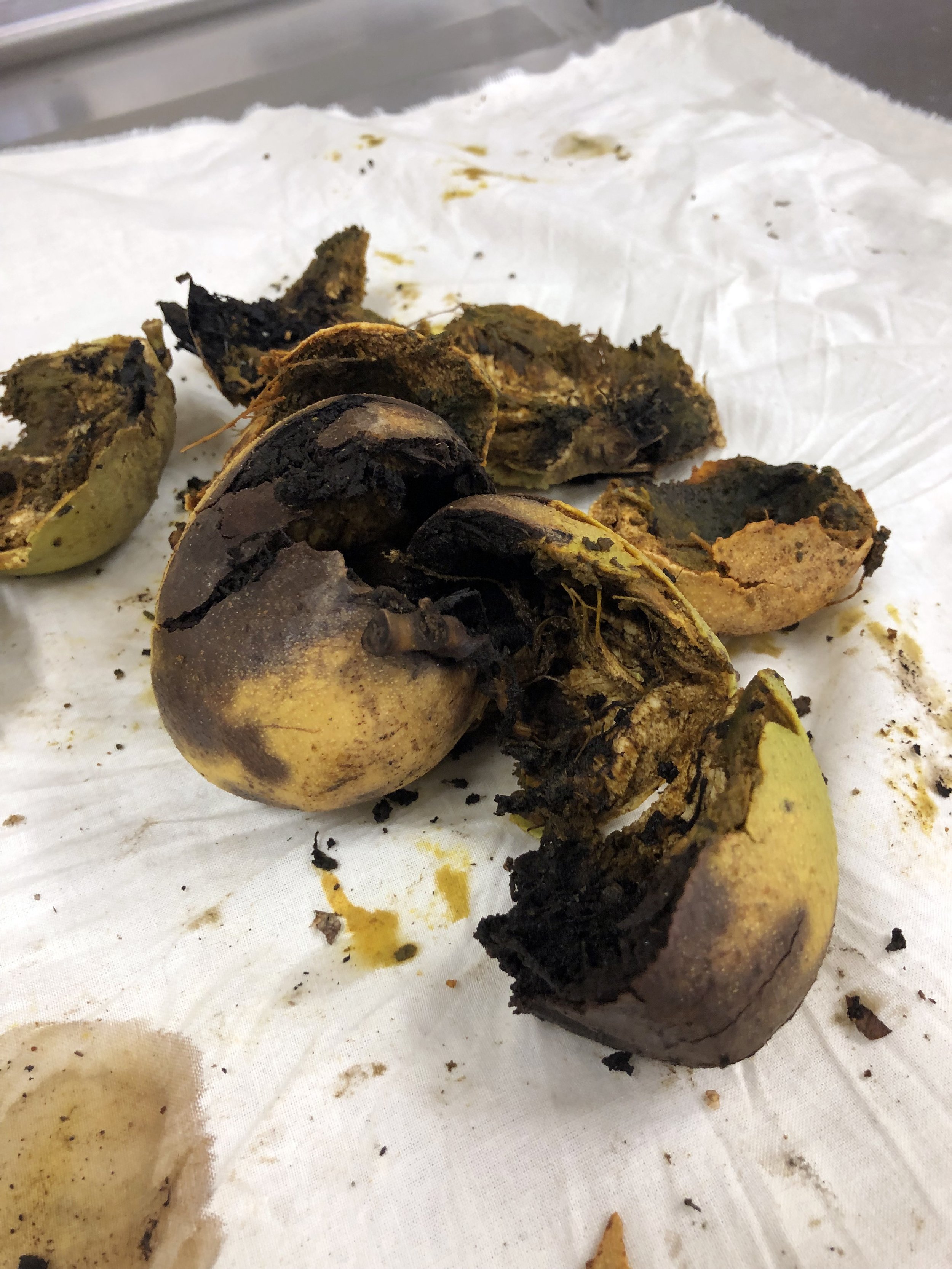
Bioplastics blended with agricultural waste fibers (native grasses, wheat straw, natural dyes) yield materials with unique aesthetics while augmenting properties and improving their sustainability. In this project, I design and fabricate a chair that has an ultra-low carbon footprint and is free from petroleum and dangerous airborne chemicals, formaldehyde, chlorine, and phthalates. Modern digital fabrication technologies are leveraged to create customizable mold inserts and precision sheets, profiles, and patterns. Through the versatility, strength, and beauty of these materials, the chair will demonstrate the rich possibilities of low-carbon production.


Chair Prototyping and Fabrication Video:

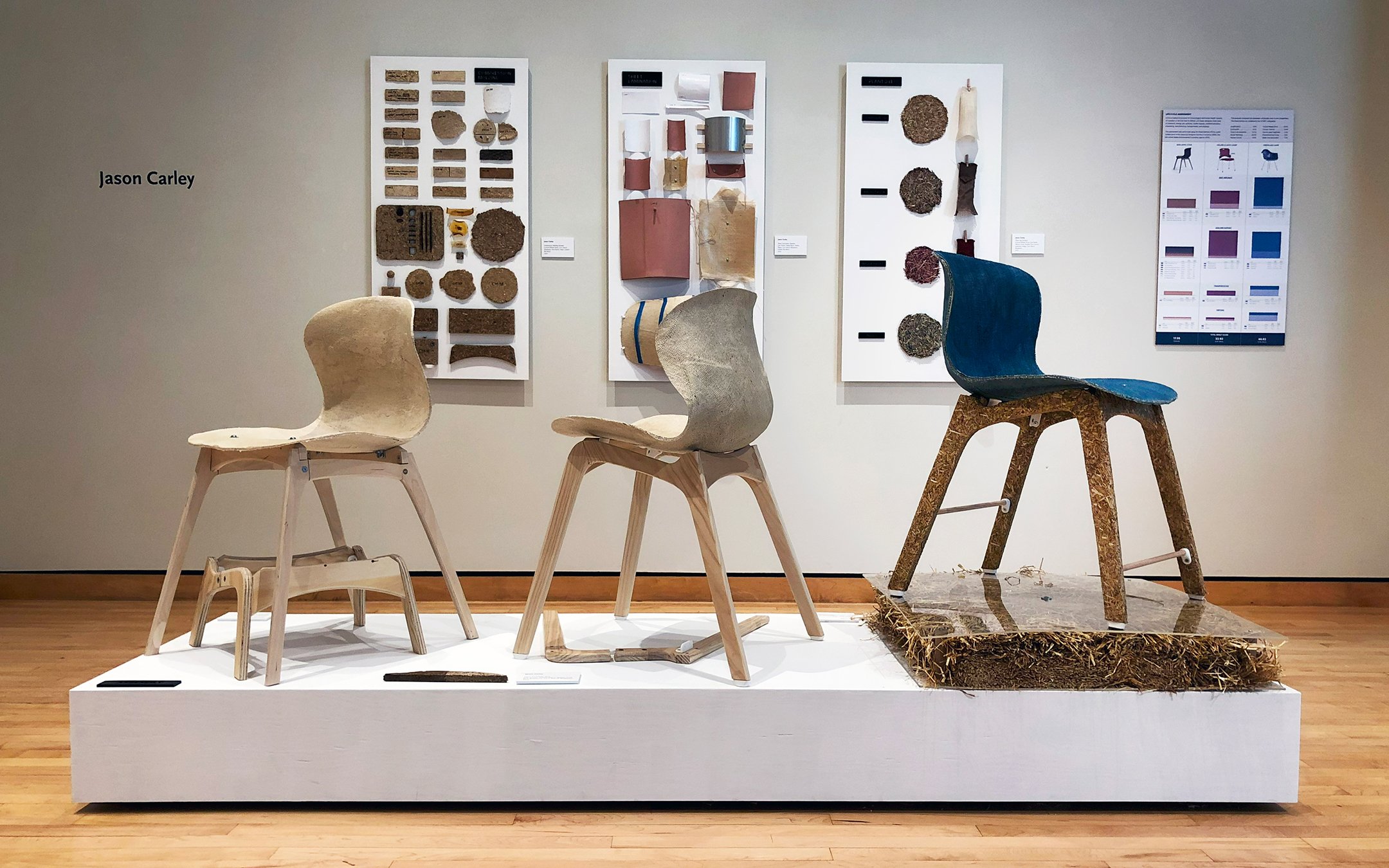
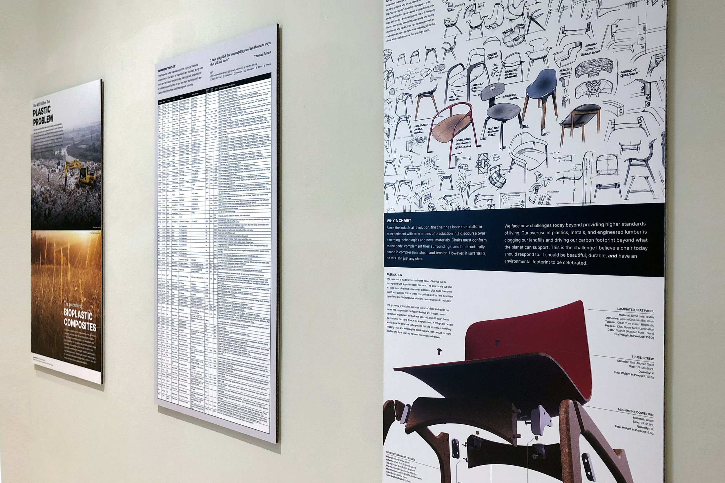
Exhibition Photos:


Research and Design Process

For my thesis project, I wanted to wade out of the conceptual space and reckon with our modern means of production. The goal of this project was not to build a chair. This was about embarking on a self-directed journey to understand the challenges of prototyping with sustainable alternatives to conventional manufacturing methods.


Background

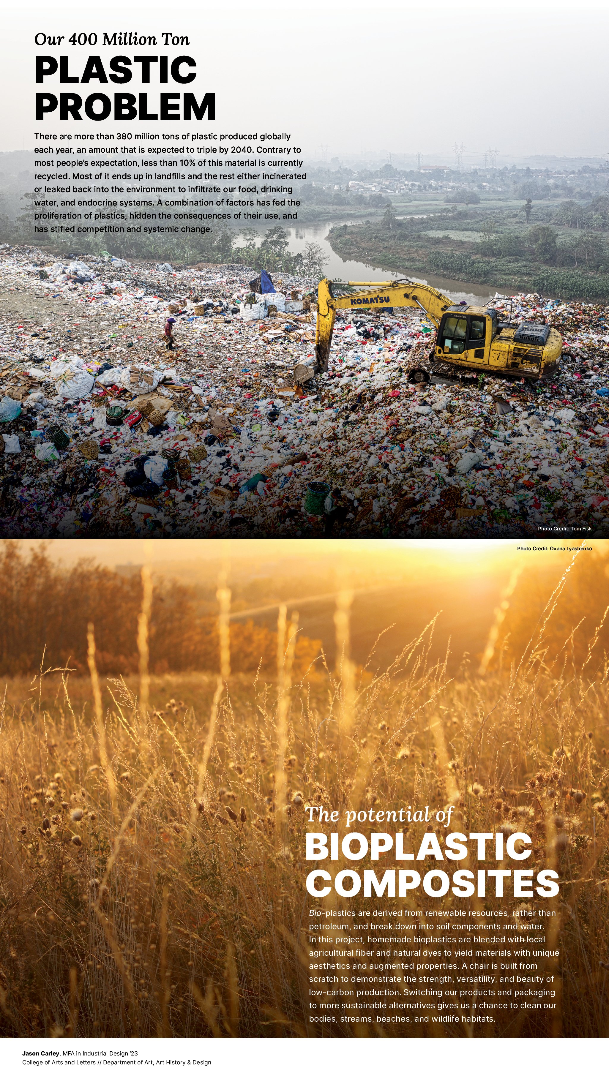
It cannot be understated how much we rely on fossil fuels - from plastic formulations to adhesives, paints and lacquers, packaging, and the vast amount of fuel that supports global trade. Plastics may be used only for a short time but take hundreds of years to break down, infiltrating our planetary systems. Our use of these materials is responsible for 8% of global greenhouse gas emissions and is projected to triple in just over seventeen years.

This extractive relationship with resources is not exclusive to plastics. Timber, whose demand is already skyrocketing, will be driven even higher as it is seen as the low-carbon alternative in the race to curb emissions by 2050, the international initiative called Net Zero. This timber needs to come from somewhere, and currently just 13% of global forests are sustainably managed. Old growth forests are being converted to monocultures like eucalyptus, bamboo, rubberwood, and spruce, privatizing these once biodiverse regions, and pushing out workers who made a living from the land for generations.


Guided by numerous case studies and the sustainability scholars David Orr, William McDonough and Daniel Wahl, I’ve questioned whether production can be productive? More specifically, can the fabrication of a product support the collection of waste materials, share economic opportunity, and fund the growth of plants that improve ecological resilience. 

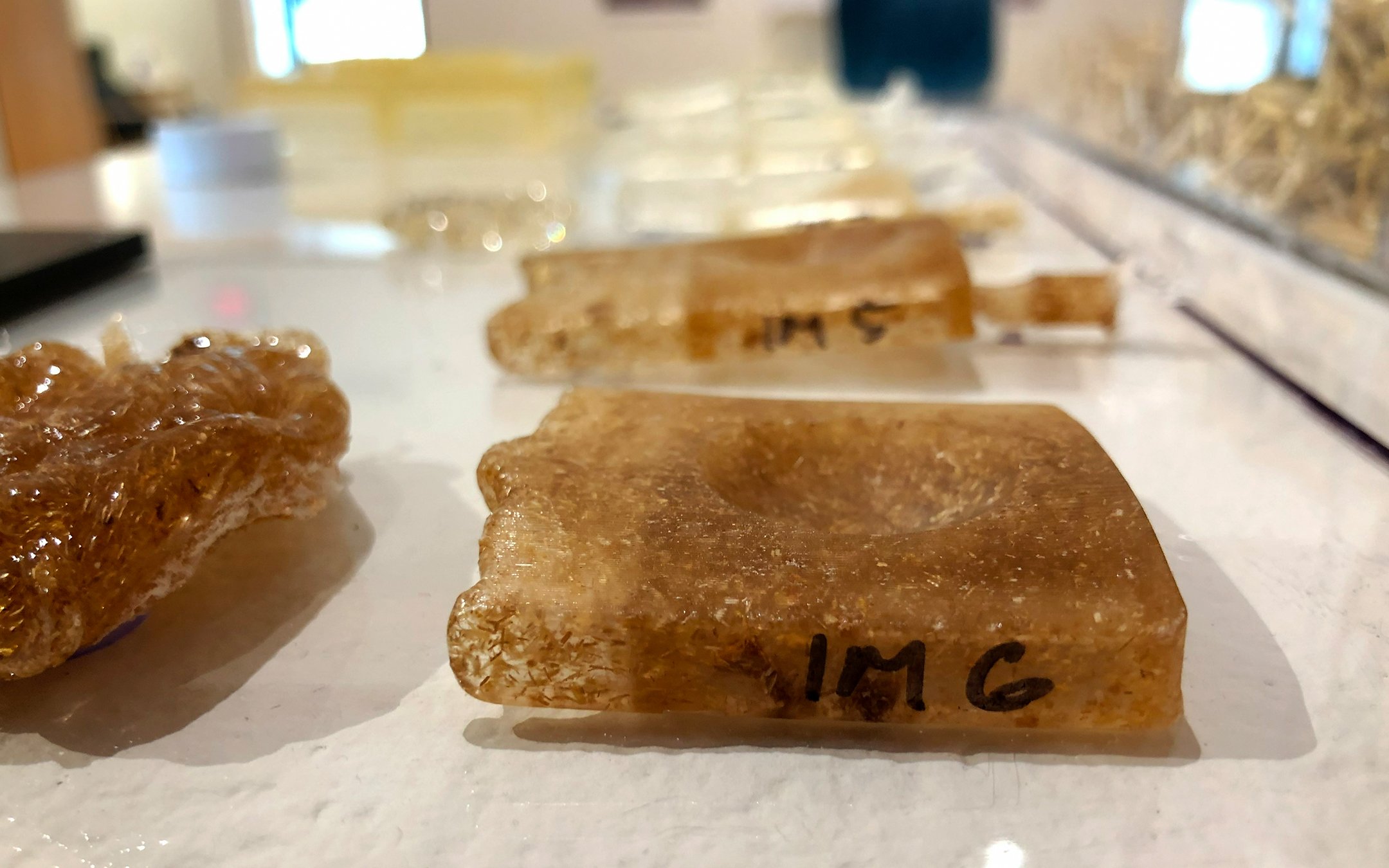
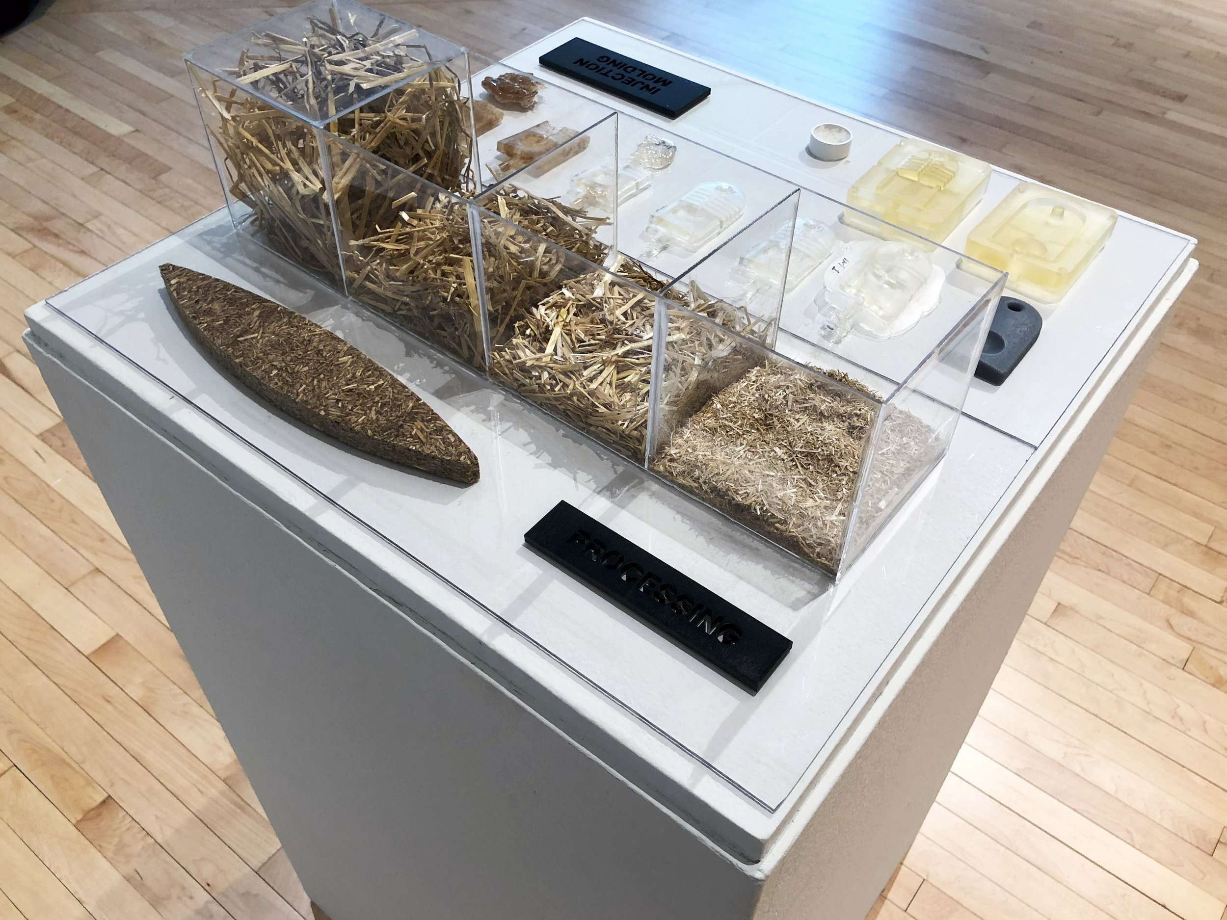
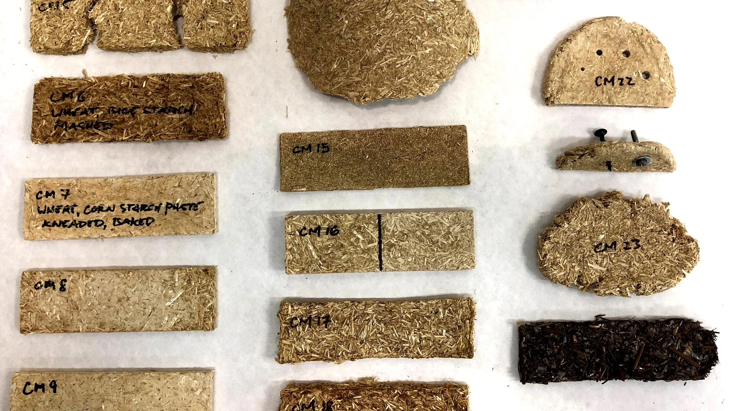
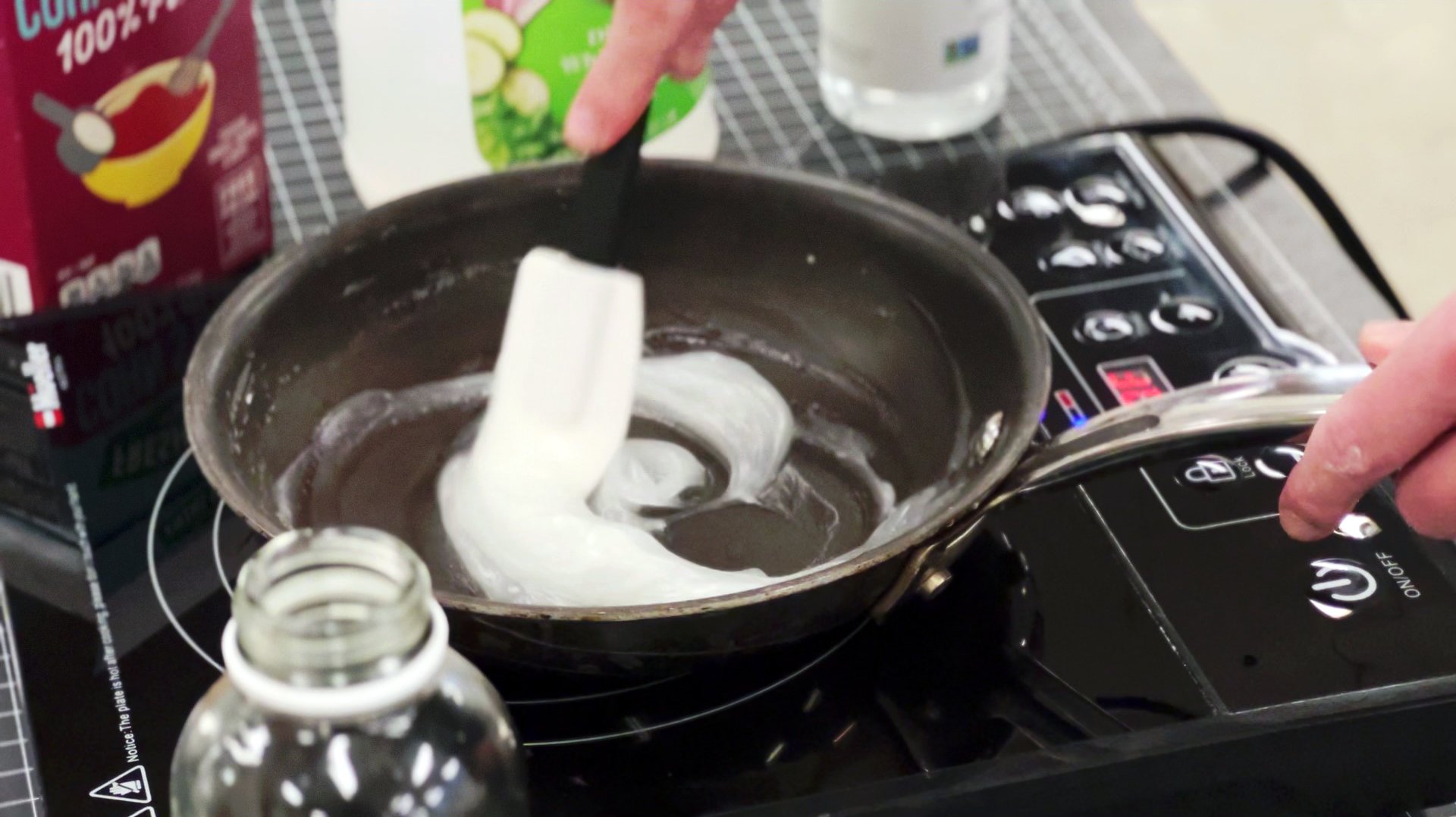
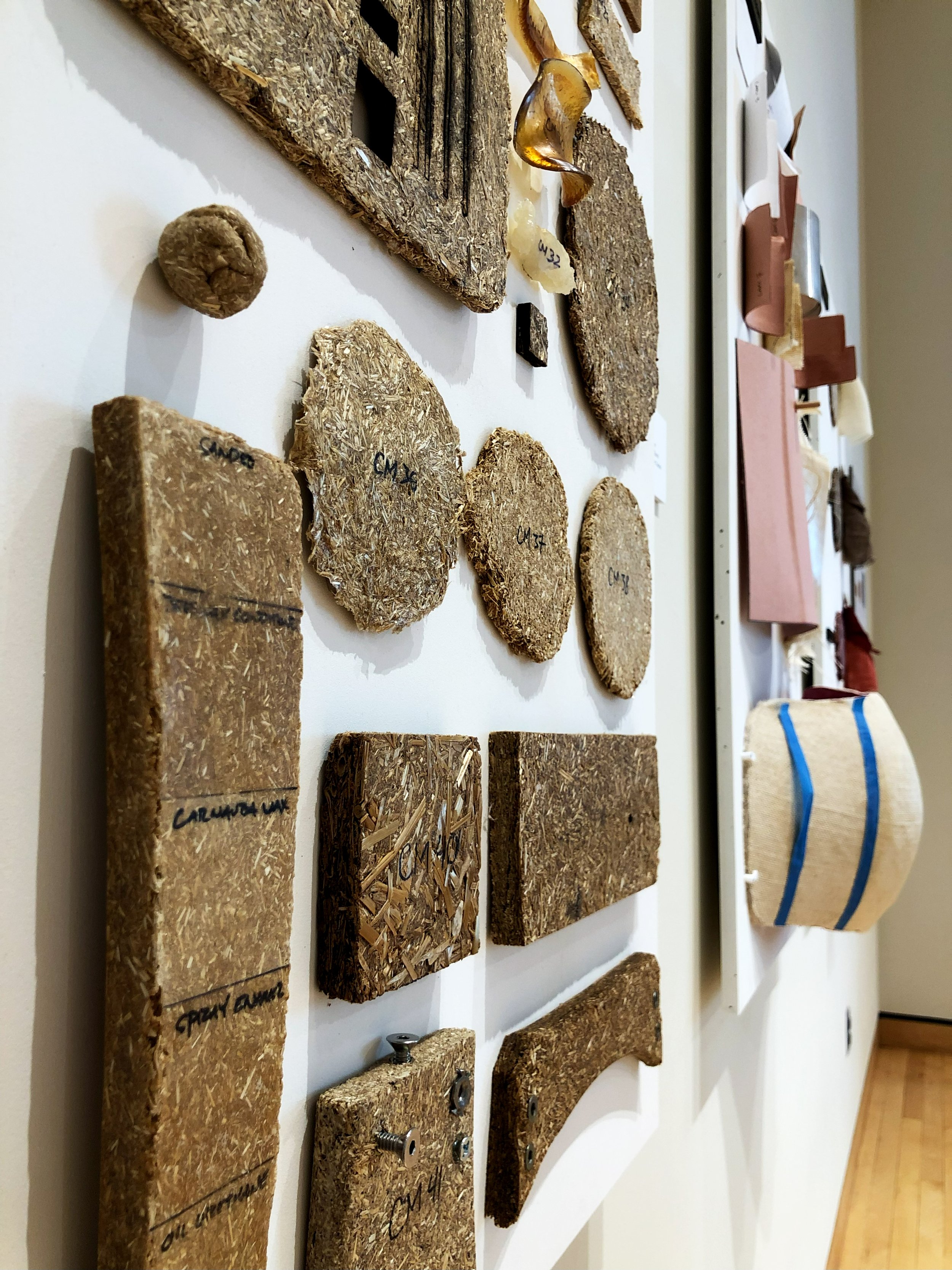
In the fall semester, I created and tested over a hundred samples of bioplastic composite materials. Bioplastics are derived from renewable resources, rather than petroleum, and break down into soil components and water. When blended with a fiber or an aggregate, it becomes a composite, possessing augmented properties, aesthetics, and cost. 


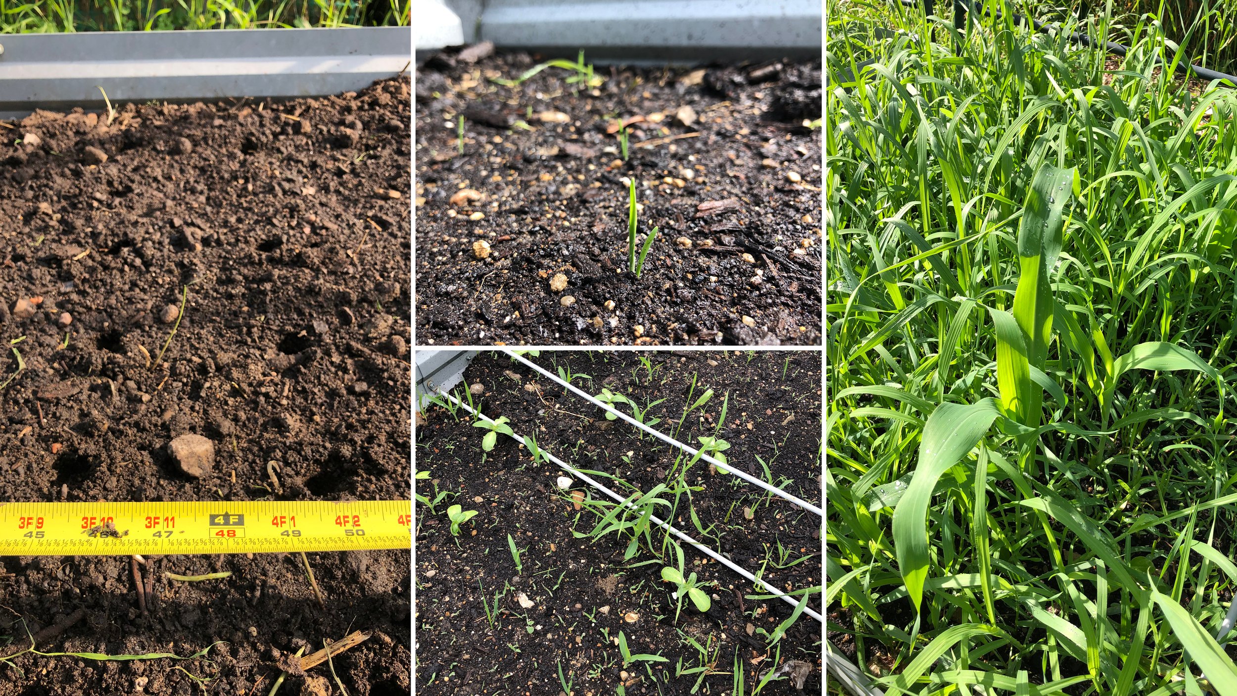
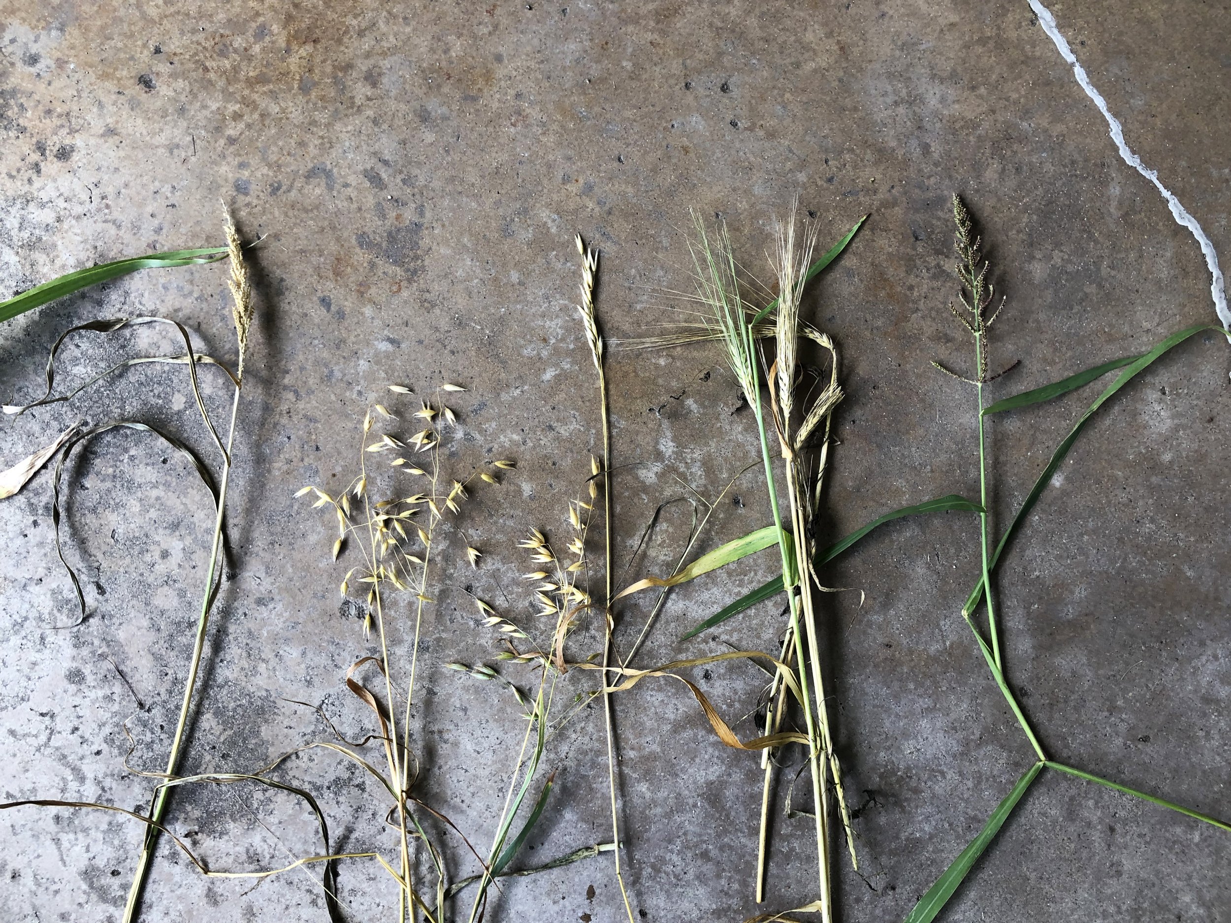
Wanting to see this process through from start to finish, I grew my own plot of prairie grasses and cereal crops over the summer. I harvested in October, leaving ground cover to shelter the soil from the winter sun, reduce erosion, and provide overwintering habitat for wildlife. I bundled the fiber in stooks, an ancient technique for drying grain in the sun, instead of kilns.

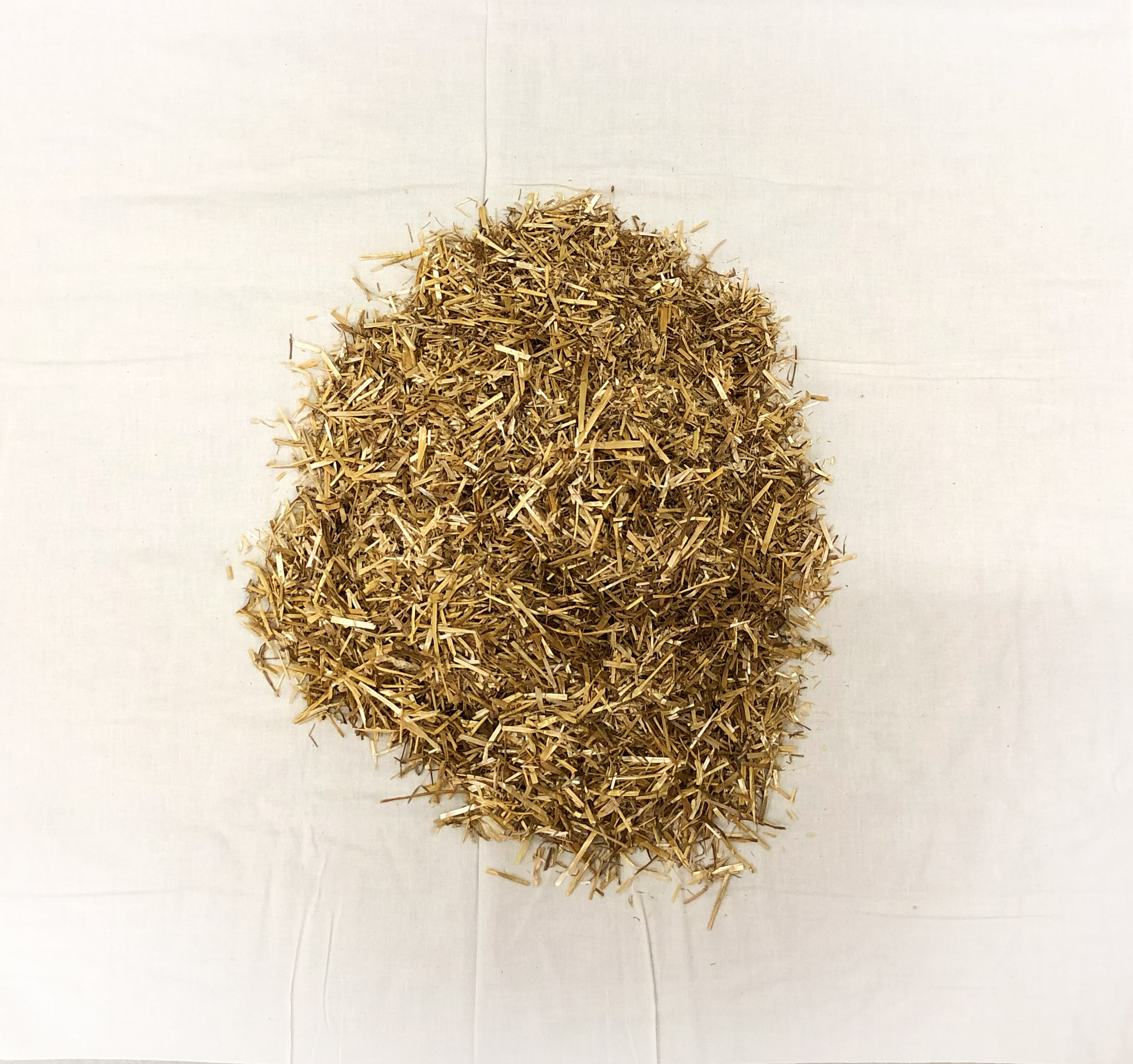
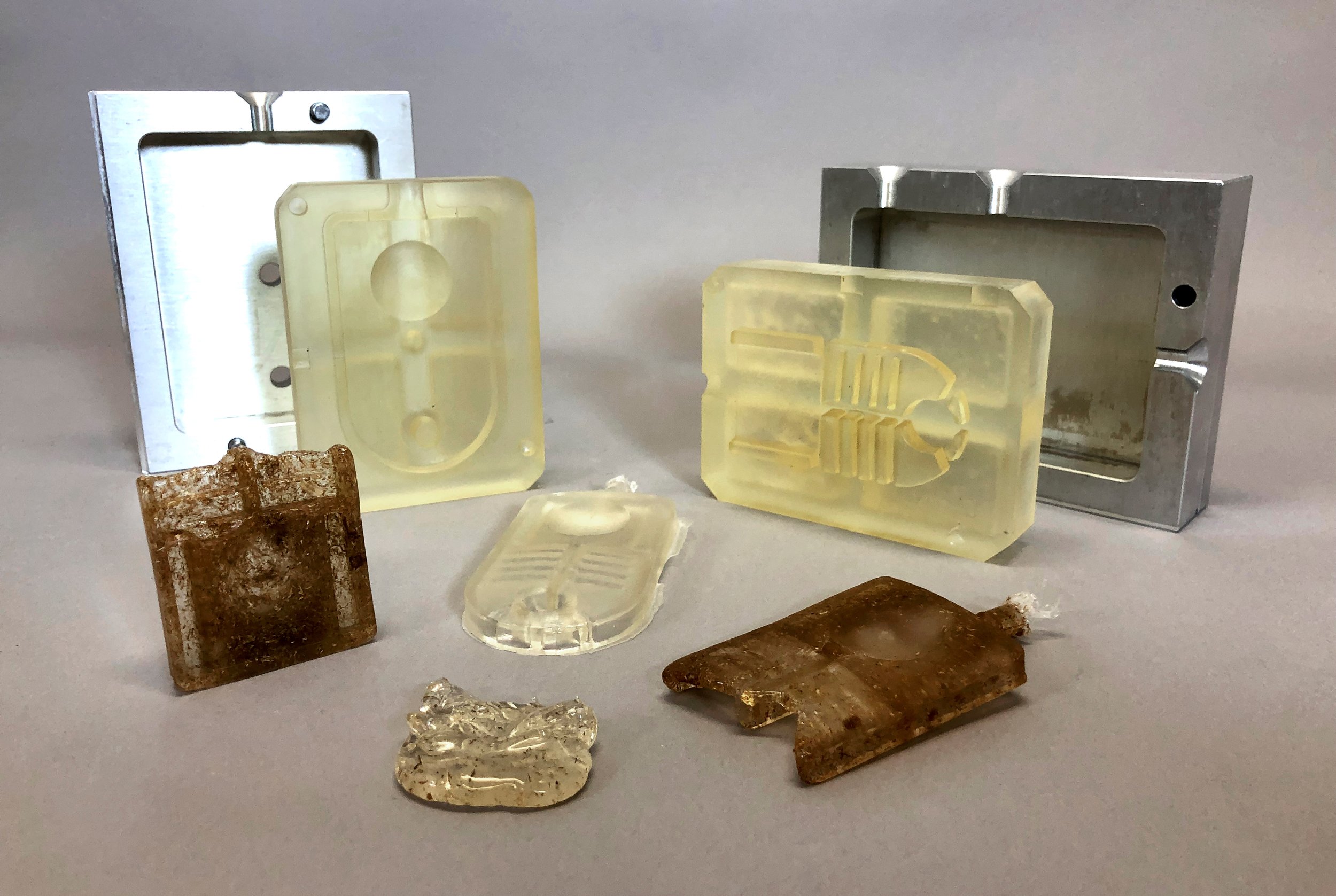
Three of these materials show promise, and with further testing, may be commercialized. Compression-molded ground straw blended with a bioplastic paste targets conventional OSB, MDF, and plywood; formed fabric panels laminated with bio-resin targets conventional fiberglass and elastomers; and sugarcane PLA blended with wheat, hemp, or flax powder targets conventional injection-molded plastic. These composites are free from petroleum ingredients and biodegrade with long-term exposure to moisture.


Design Process

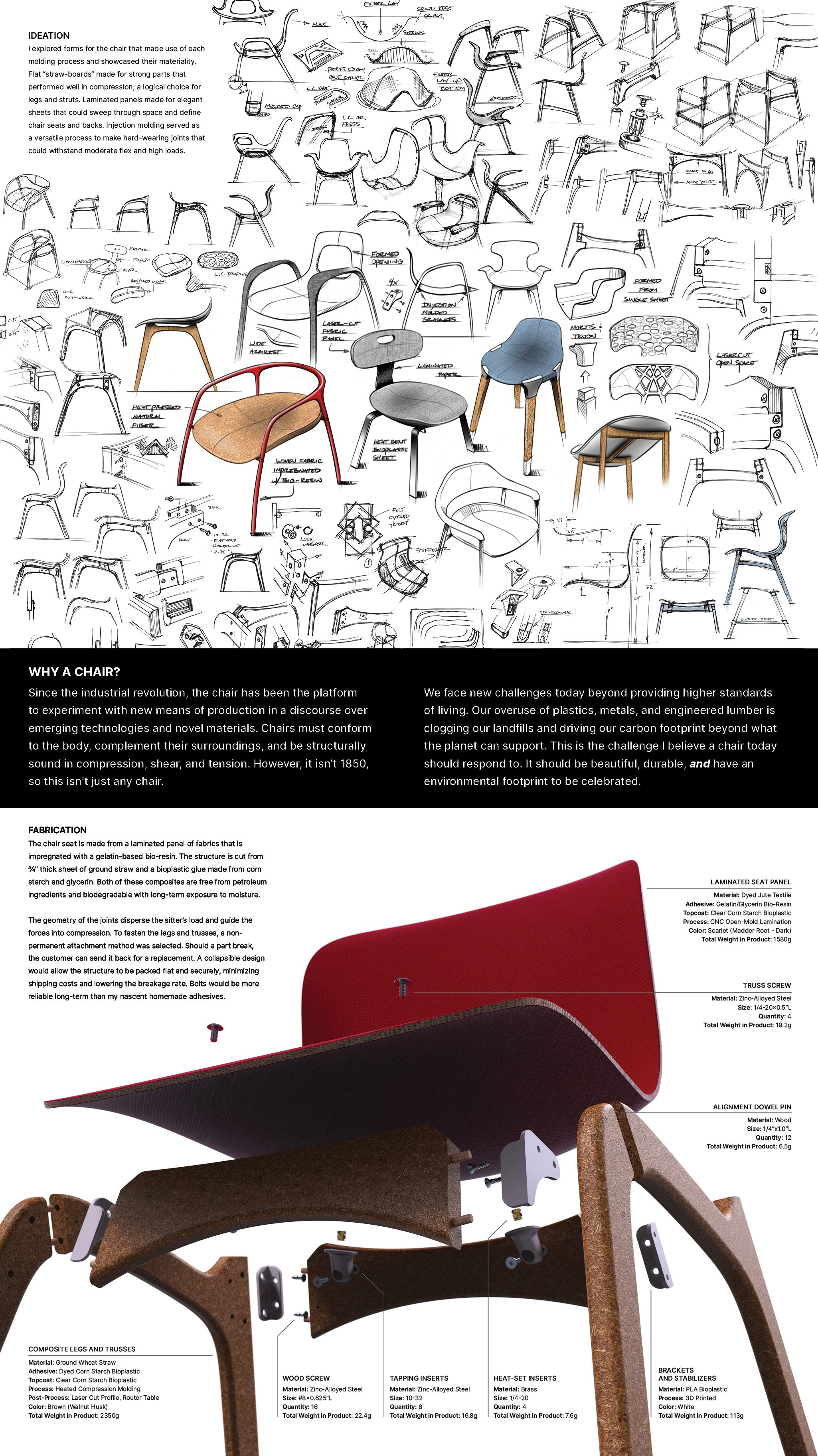
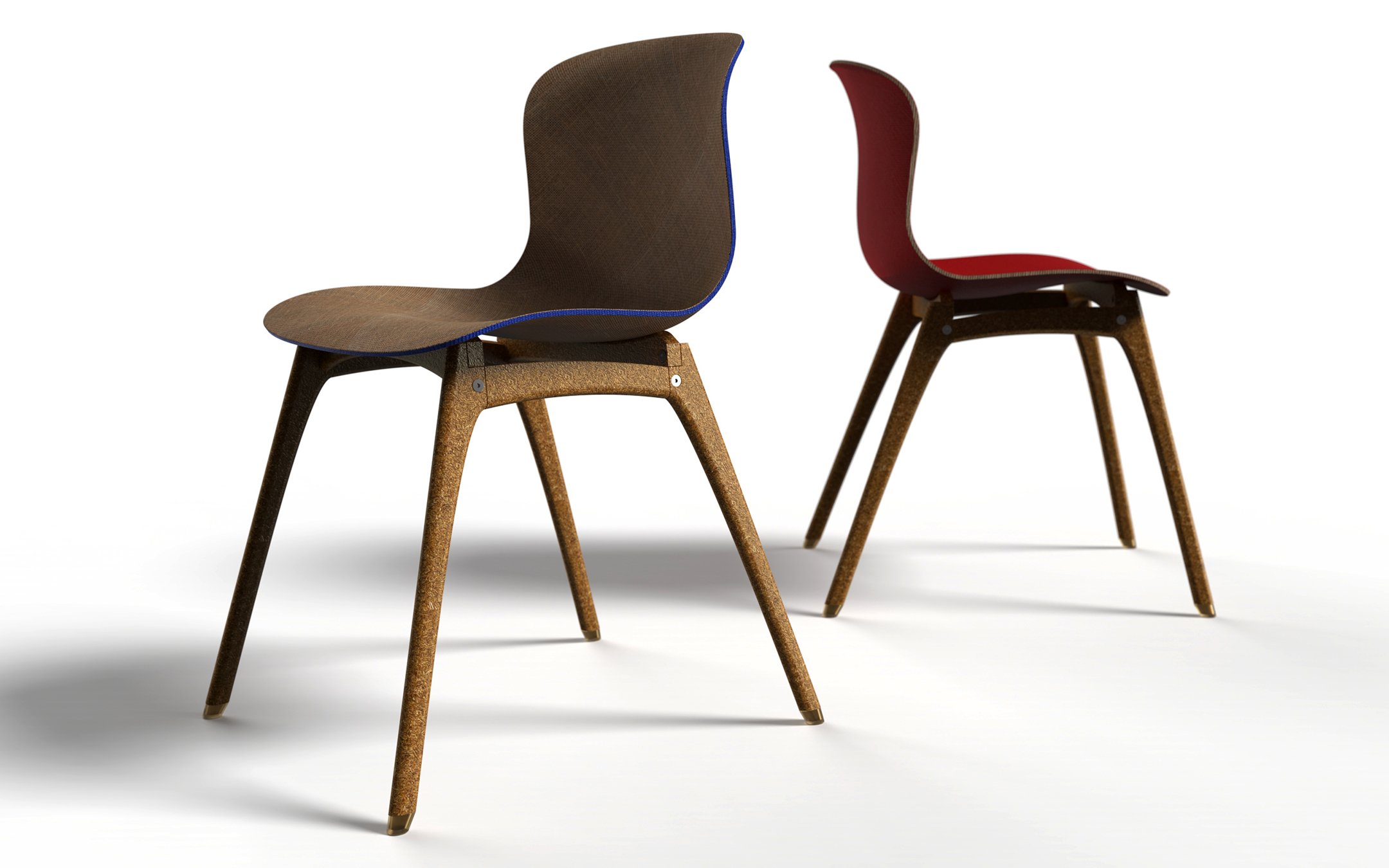
My concepts for the chair made use of each molding process and showcased their materiality. With digital fabrication, I could achieve contemporary, high precision forms. The final design is fashioned as a task chair for public spaces, like schools or conference halls. It has a contoured seat with lumbar support for upright posture and a gentle lean.

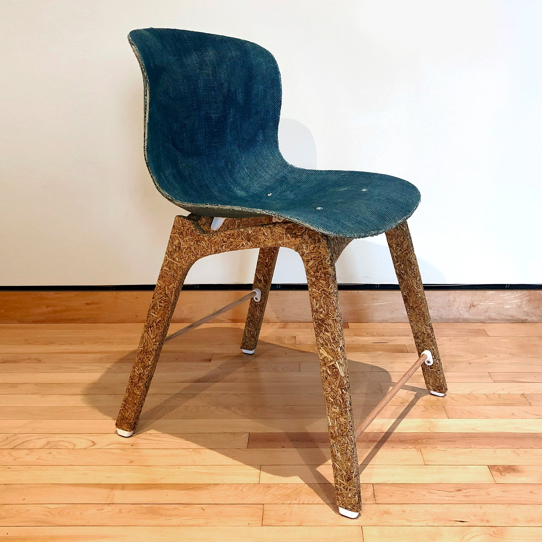
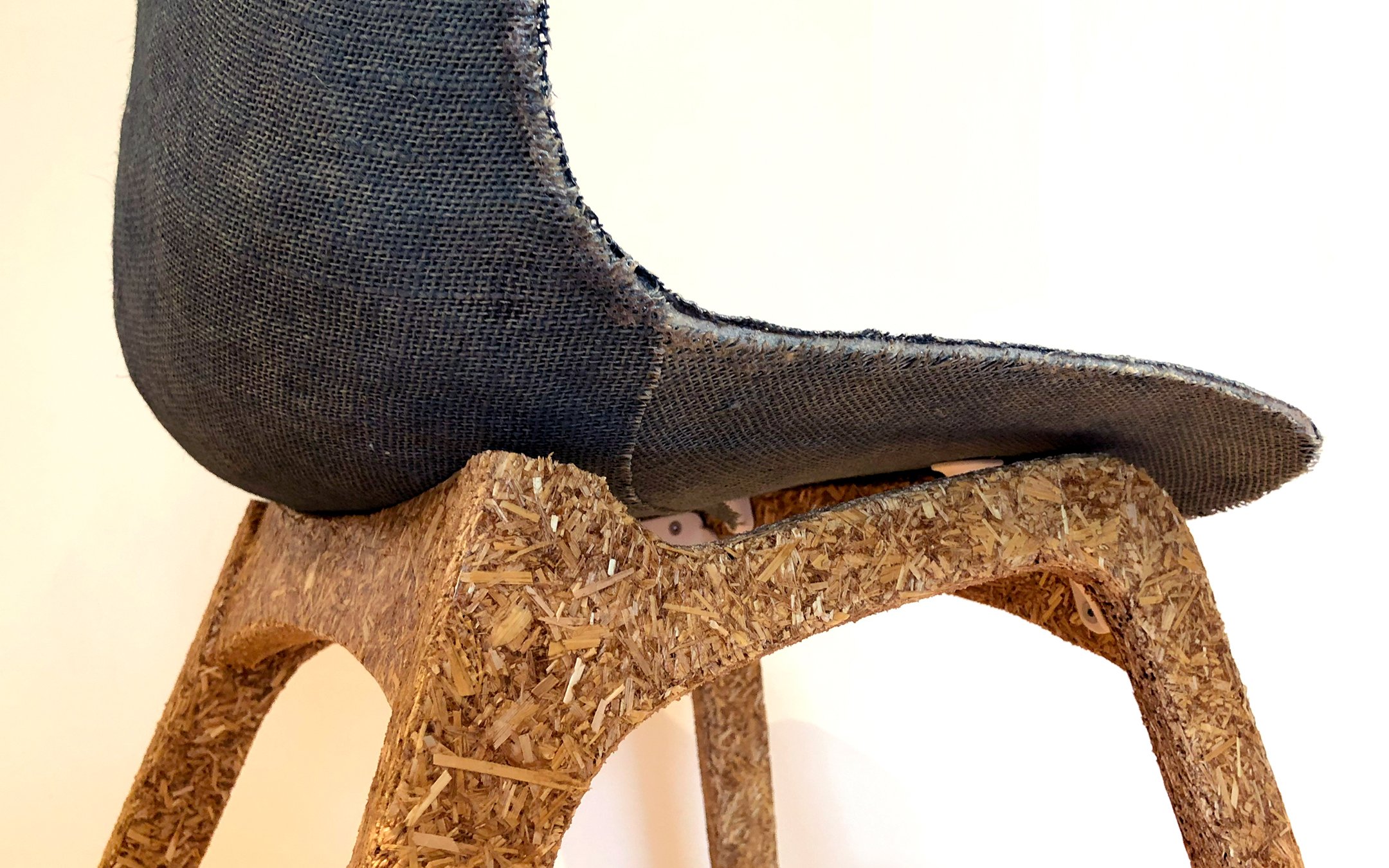
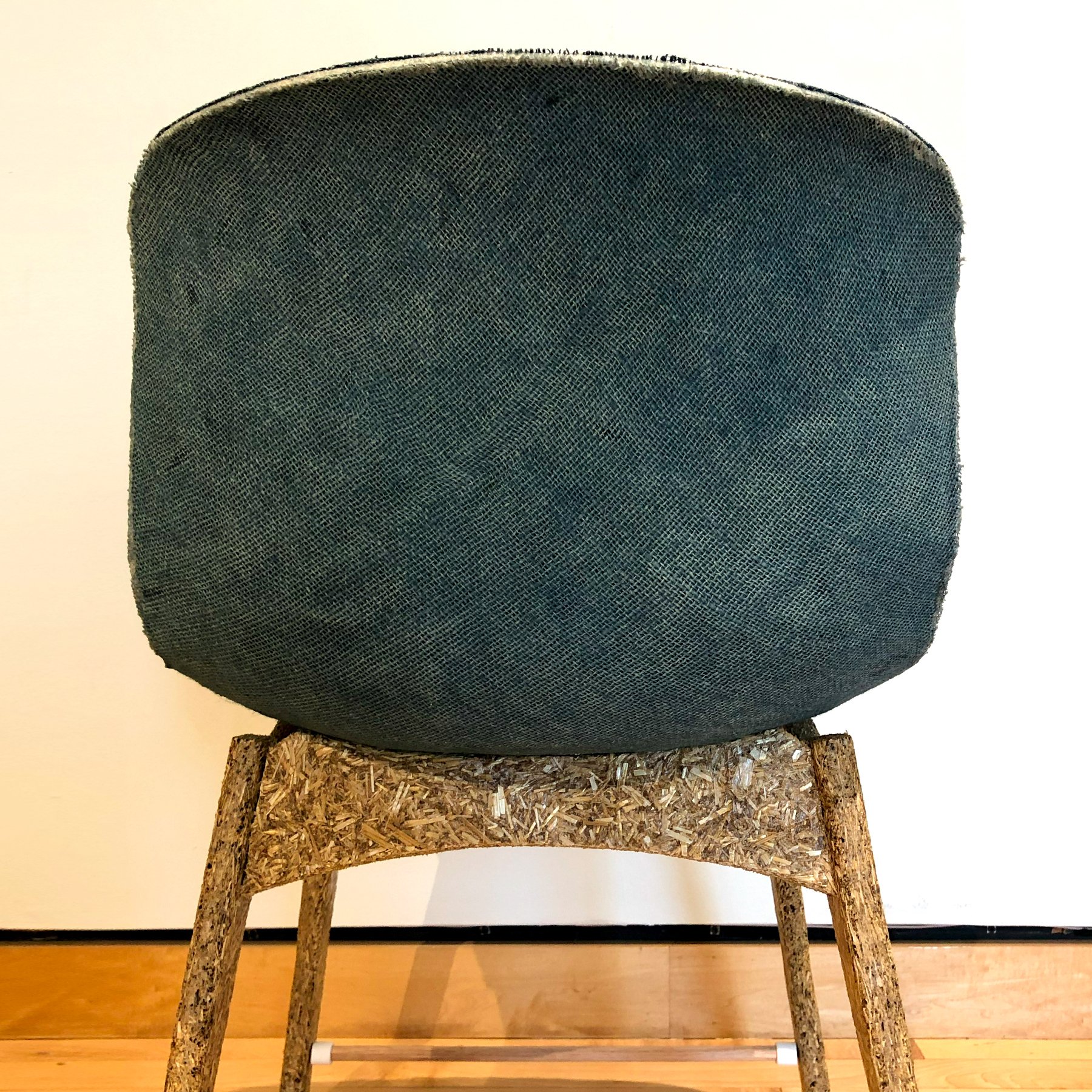
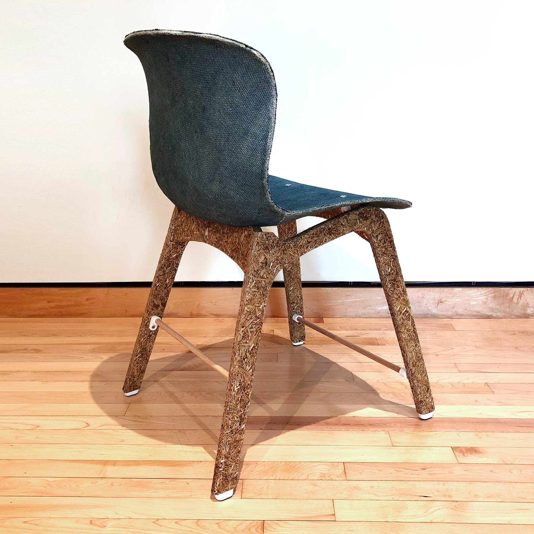
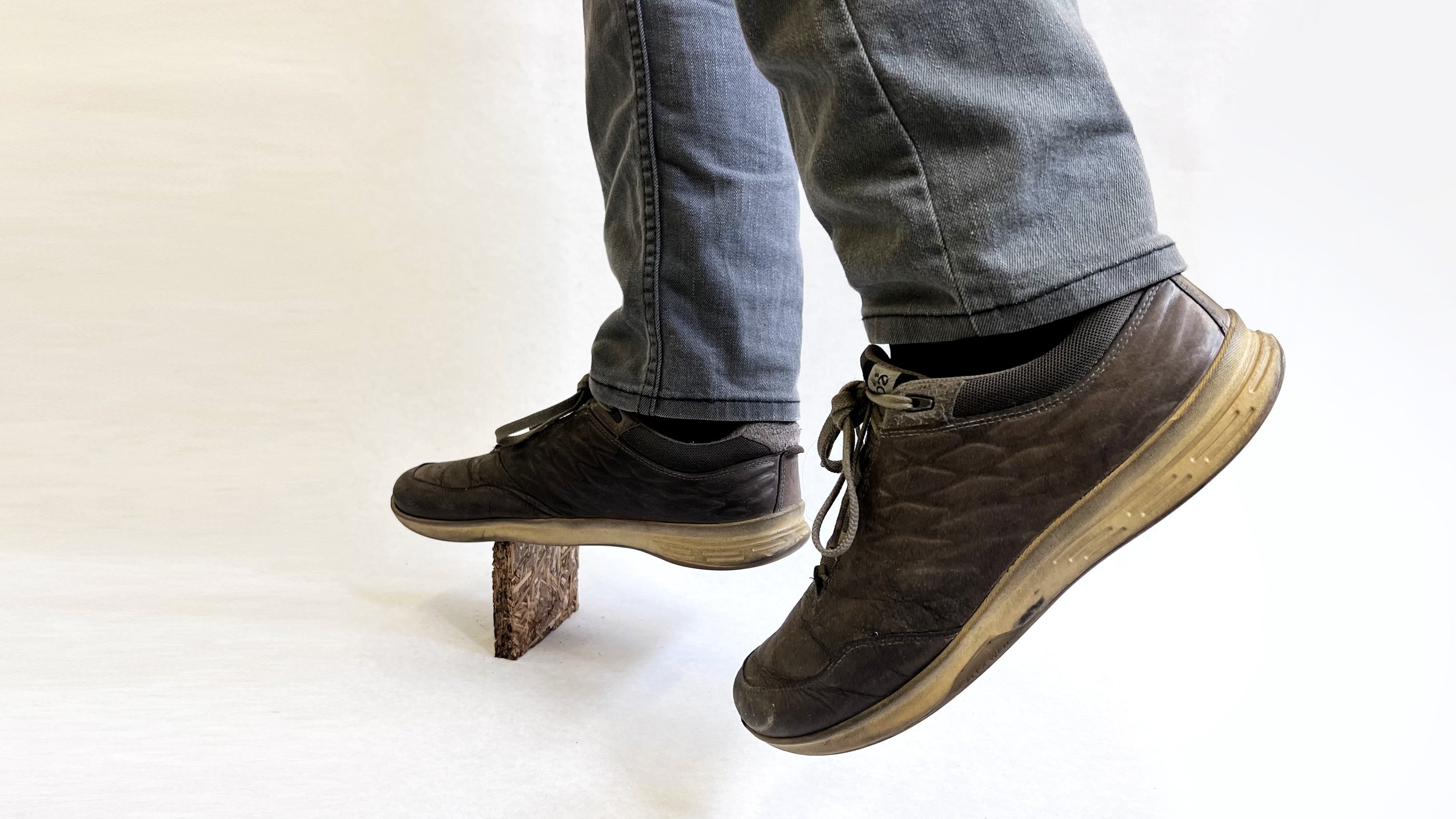
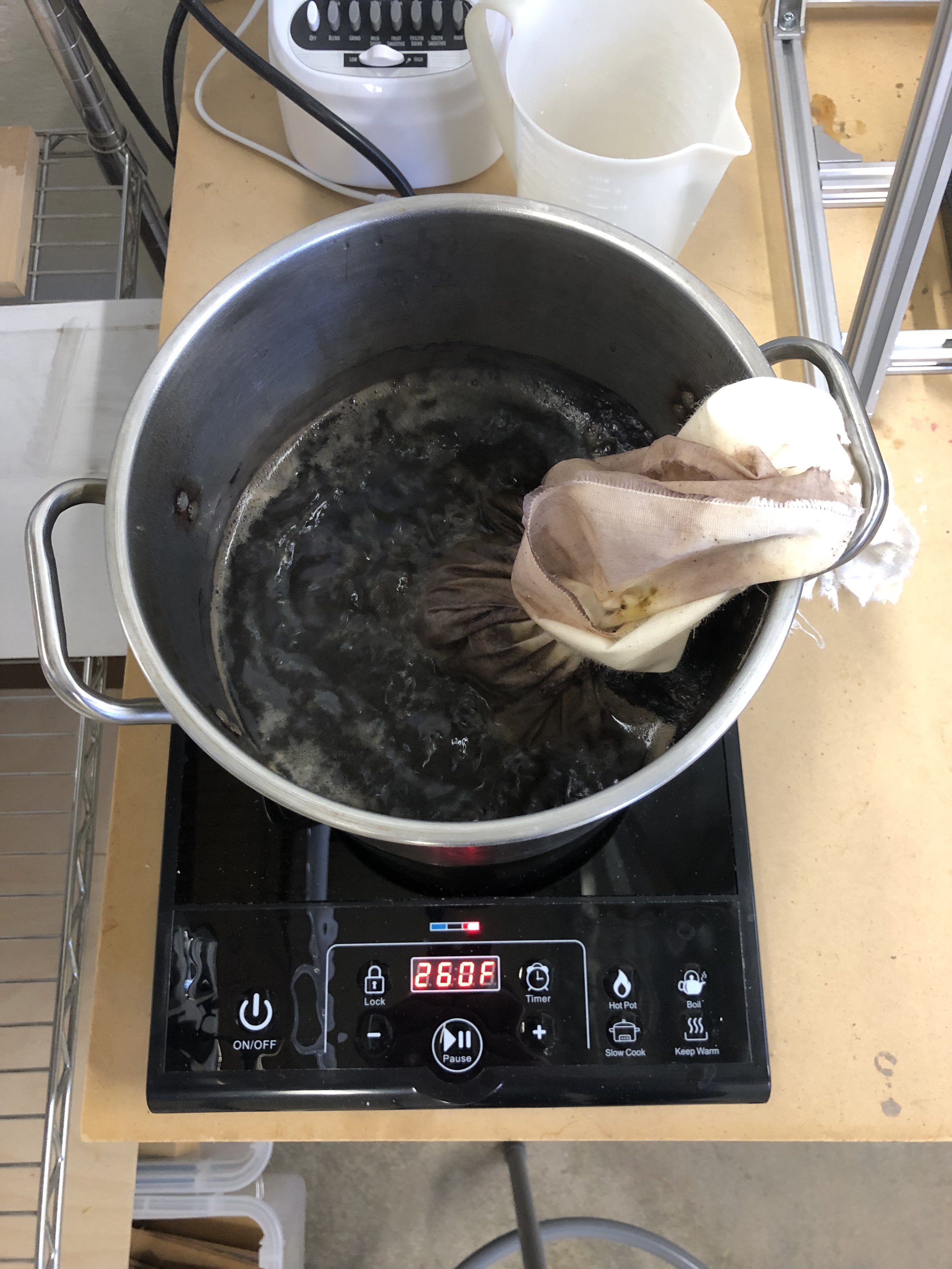
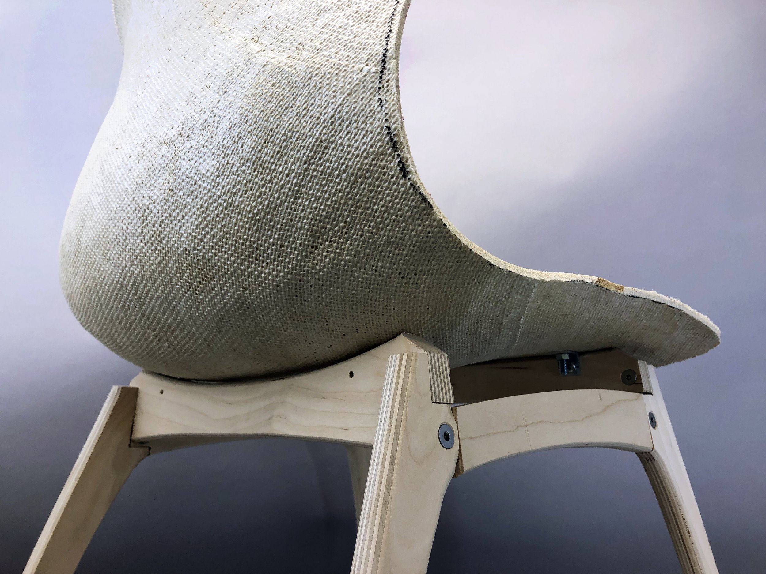
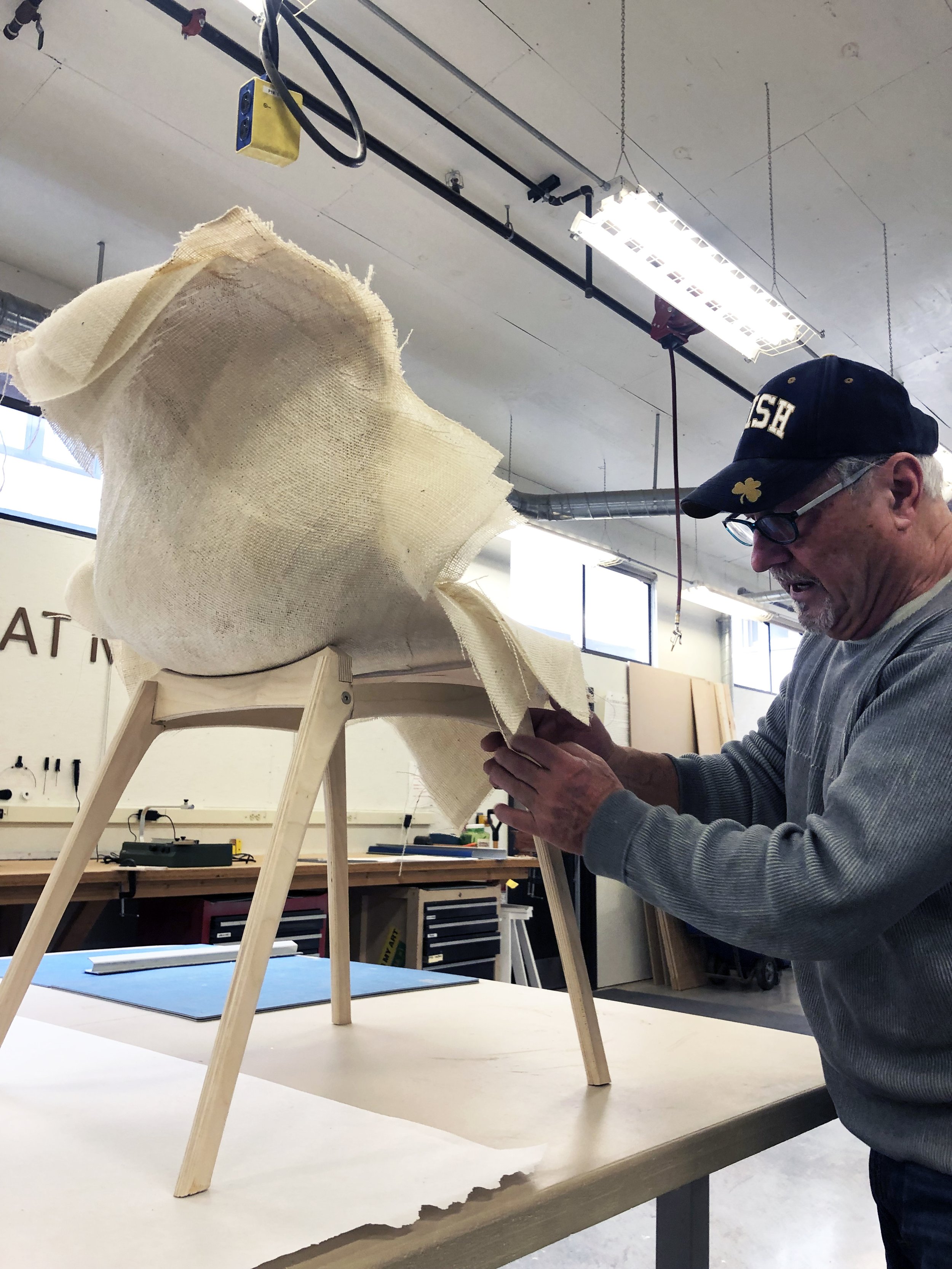
The chair seat is a laminated panel of fabrics that are impregnated with a gelatin-based bio-resin. The structure is cut from ¾” thick sheet of ground straw and a bioplastic glue made from corn starch and glycerin. Homemade bioplastics are blended with local agricultural fiber and natural dyes to yield the chair’s seat, legs, trusses, and brackets, representing 98.2% of the chair’s mass. The rest is composed of metal hardware, allowing the chair to be repaired and packed flat.


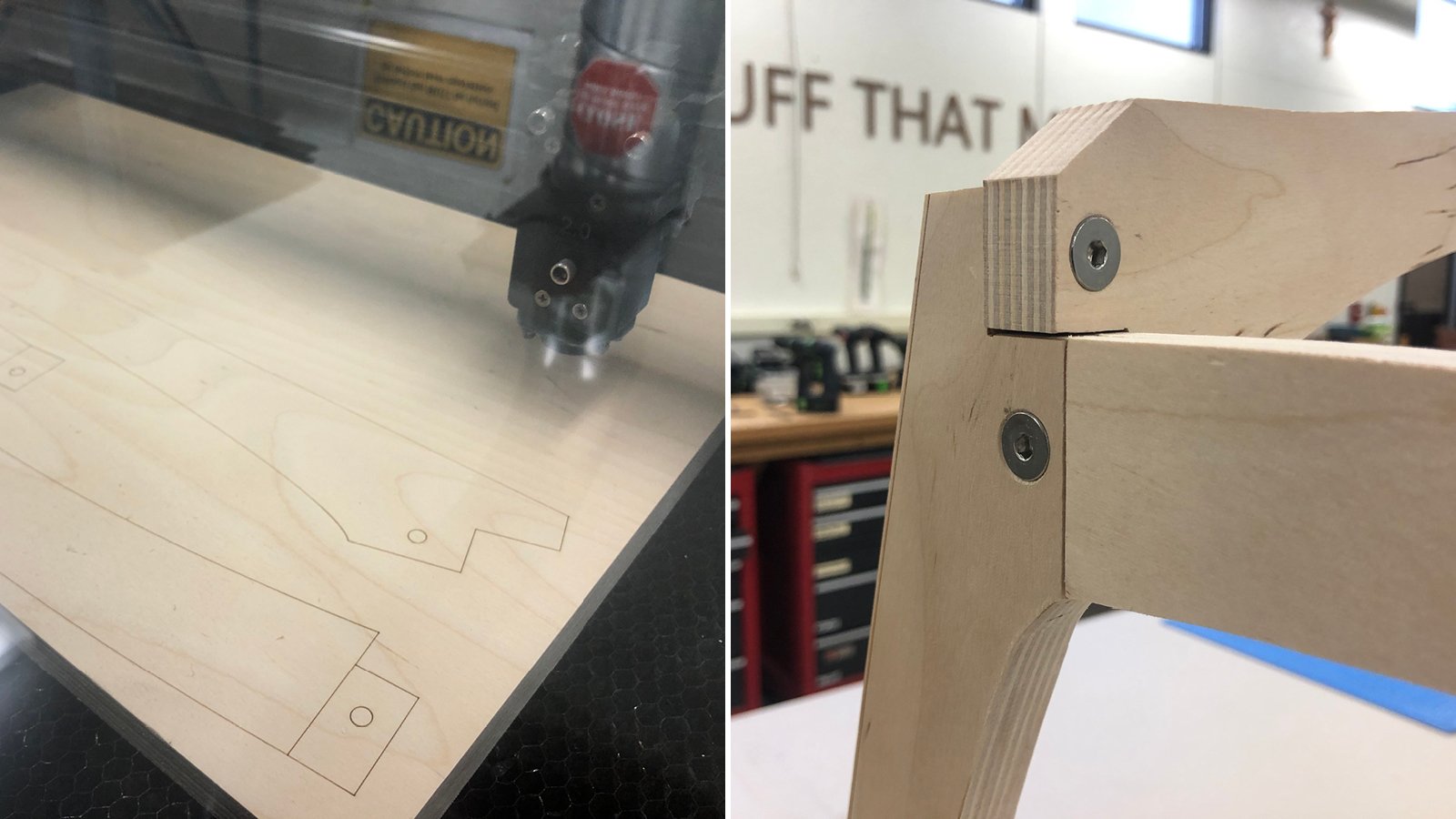
Lasercut Leg Pattern: The Chair’s legs and trusses were designed to be cut from a single 24” x 16” Straw-Board. One 4’ x 8’ sheet could yield the base for twelve chairs. All of the scrap is reground for later use.


Life Cycle Assessment / Implications

For an objective evaluation of how “sustainable” this chair is, I’ve used the IDSA’s Okala Method to perform a life cycle assessment of this chair against two common competitors. This chair’s footprint is roughly half of an aluminum and plastic chair, and a third of one that is plated steel and fiberglass.

 In working on this project over the last eight months, I feel like I’ve just scratched the surface and am excited to see where this practice goes next. While it isn’t easy, fabricating with regionally produced, natural materials can dramatically lower the environmental footprint of our goods and supply chains, and demonstrate that materials not derived from petroleum can be viable and attractive alternatives.


RV2035: Escape Into Nature

Cover.jpg

In an increasingly urban future punctuated by the stresses of congestion, severe weather events, and the occasional pandemic, natural experiences will become ever more necessary - to connect, reflect, grow, and heal. 

Some will seek a more resilient and empowering lifestyle, unshackled from skyrocketing costs of living and aging infrastructures that rely on obsolete, ecologically-disruptive fuels and technologies. A mobile lifestyle will become more desirable and commonplace, for short-term escapes or for years at a time. These “Nomads” will require mastery of their resources and more efficient modes of travel, moving in and out of communities as their needs and values change. 
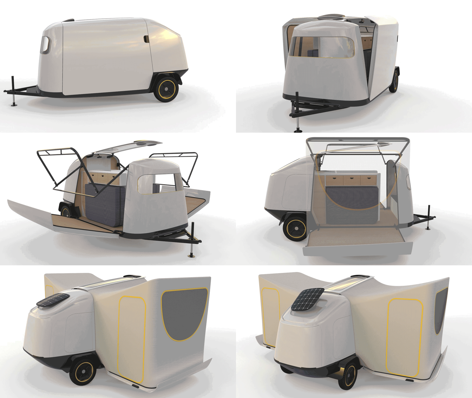
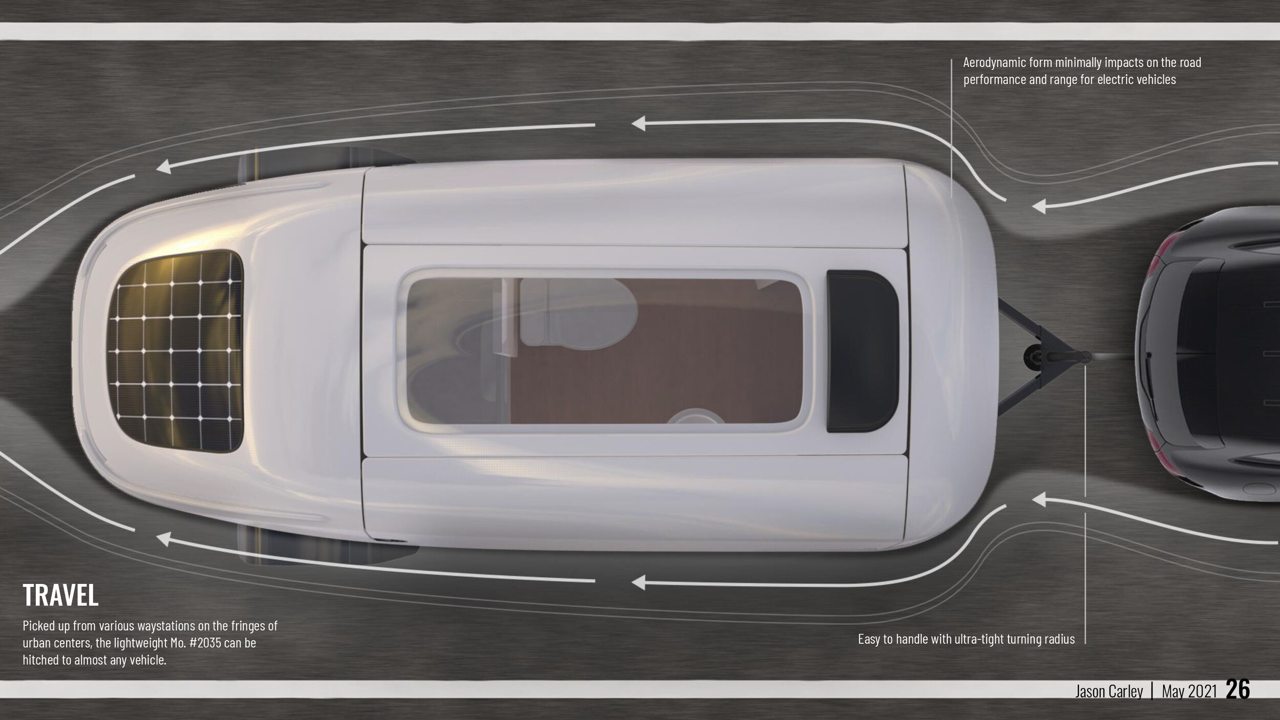
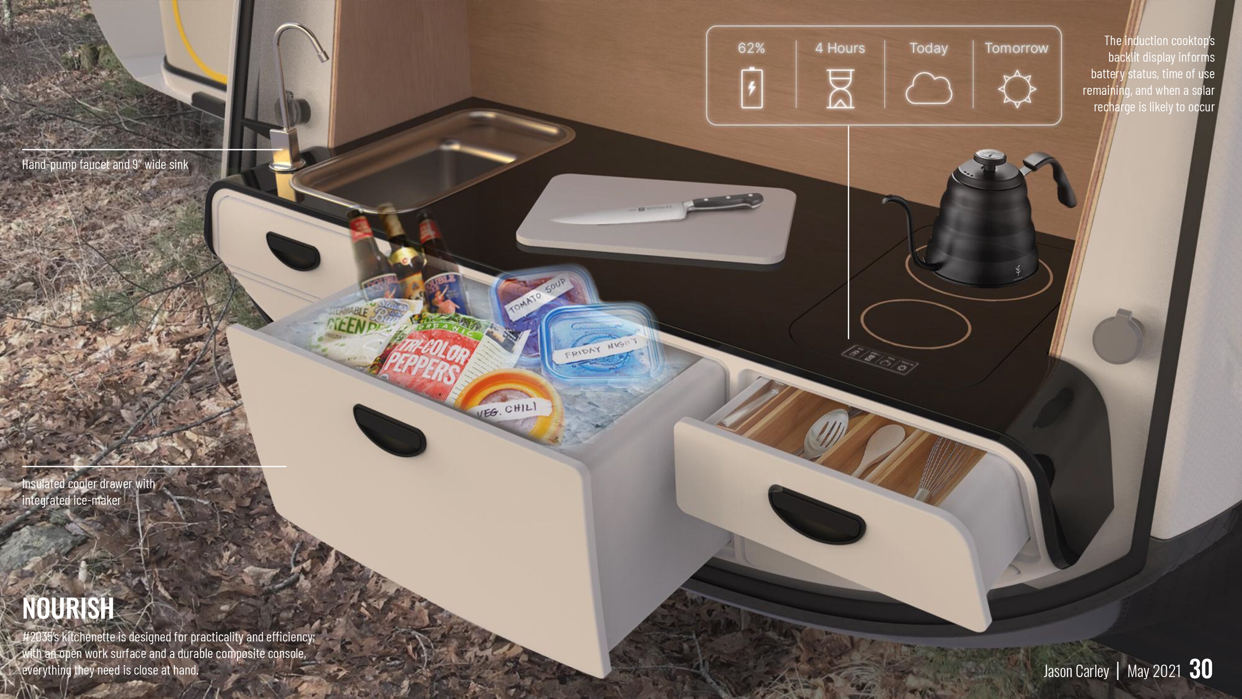
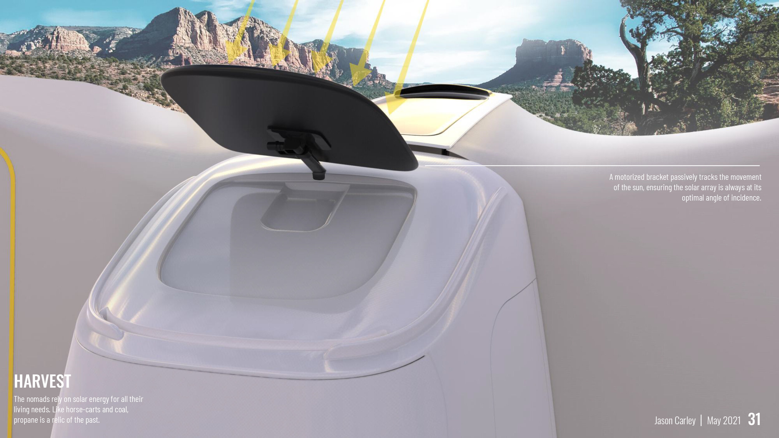
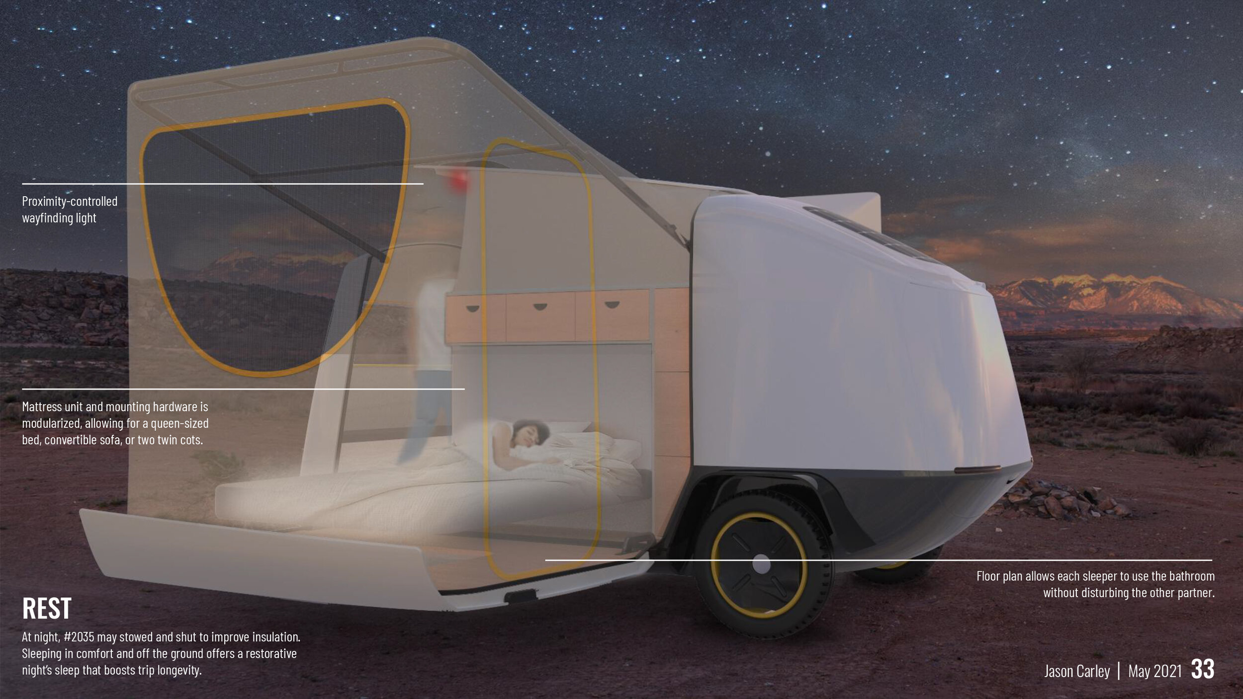
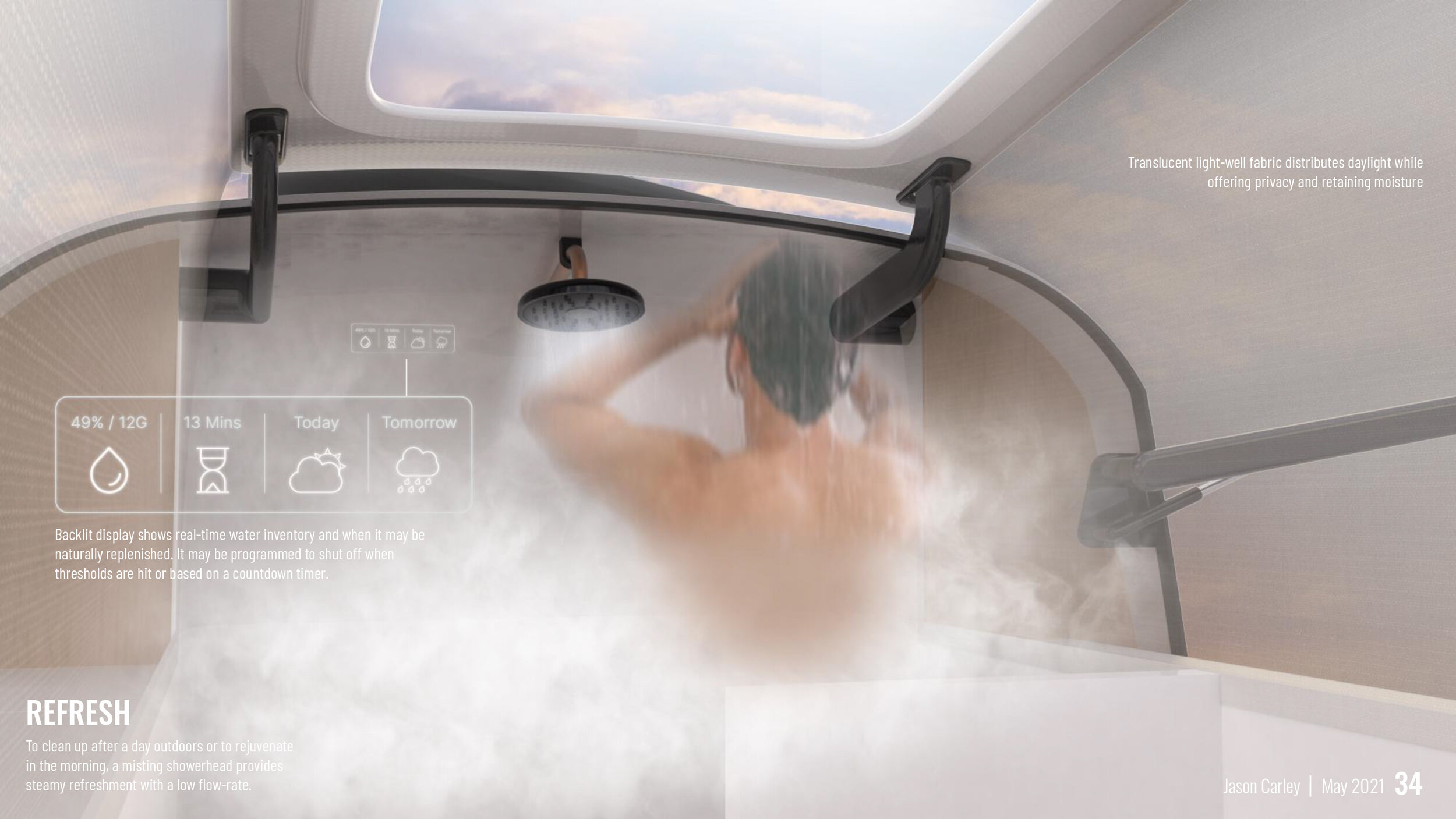
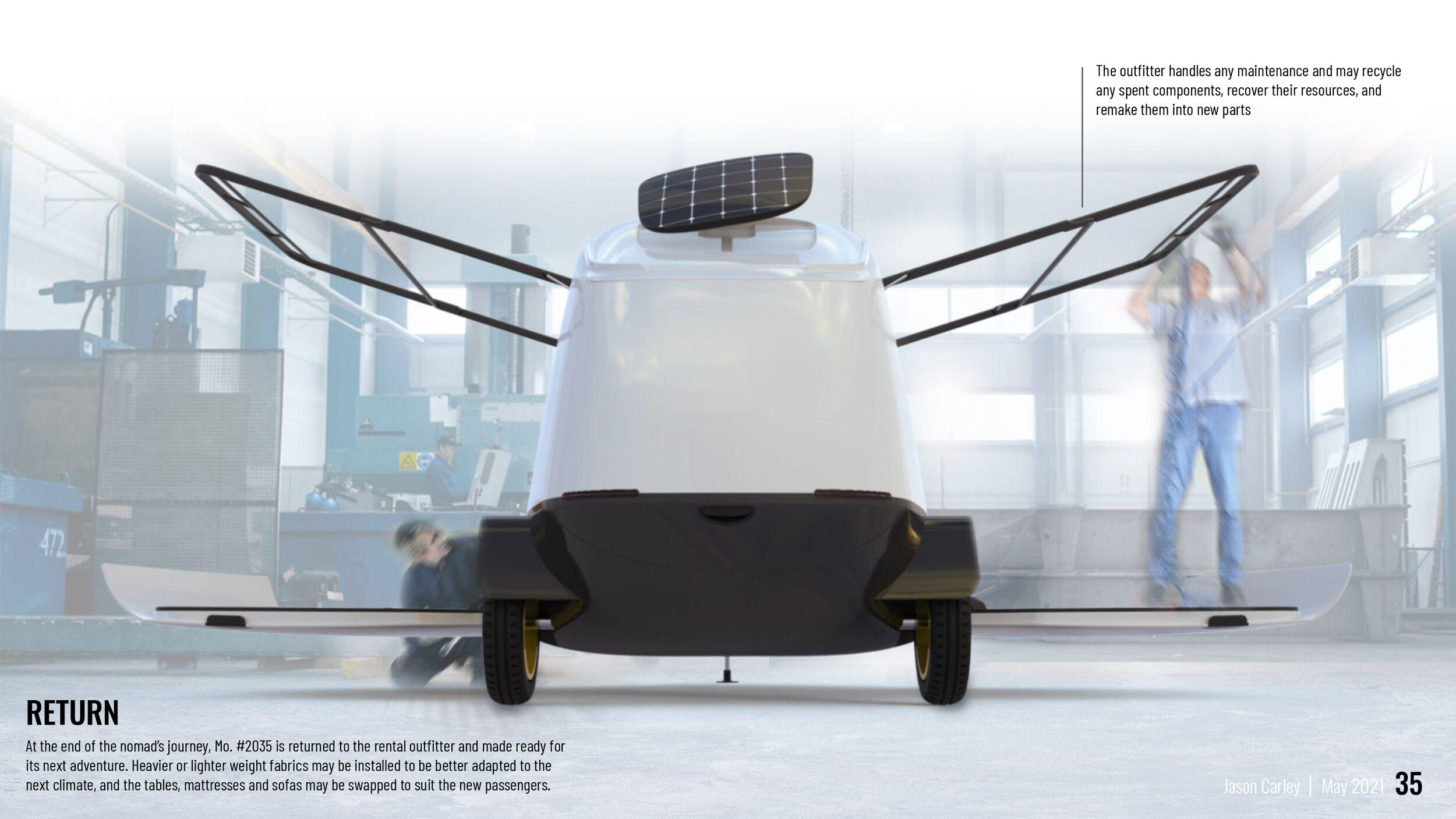
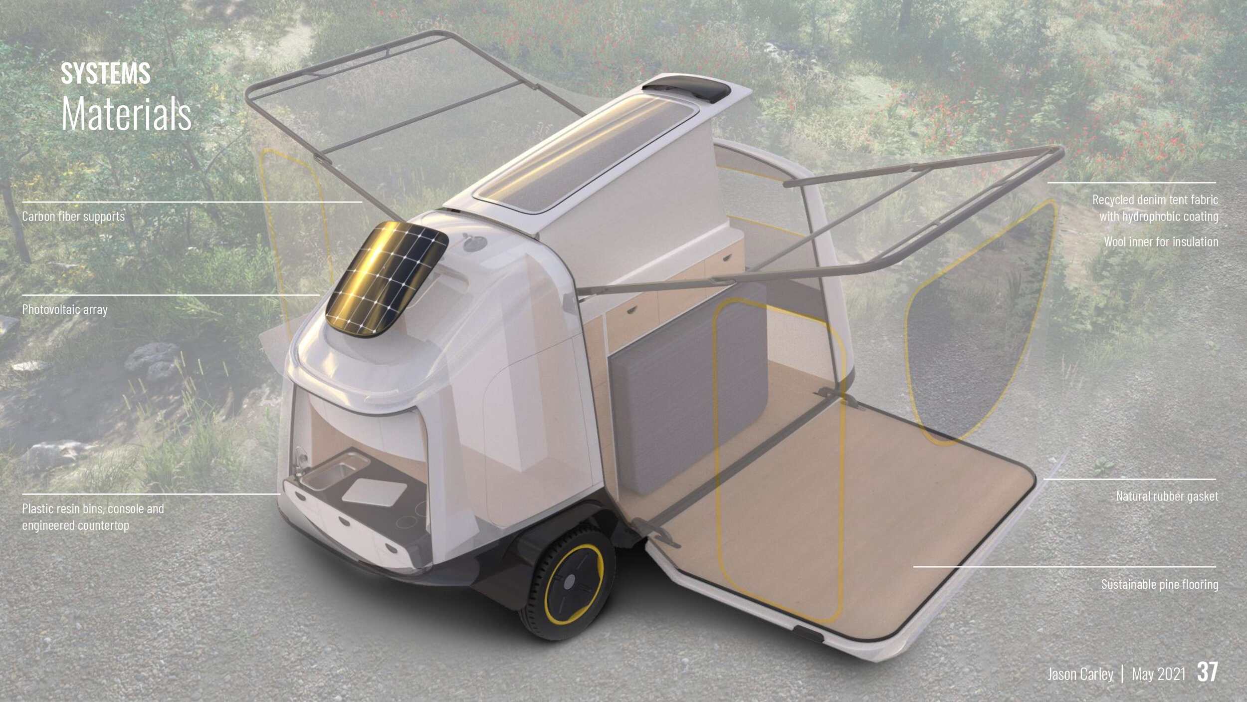
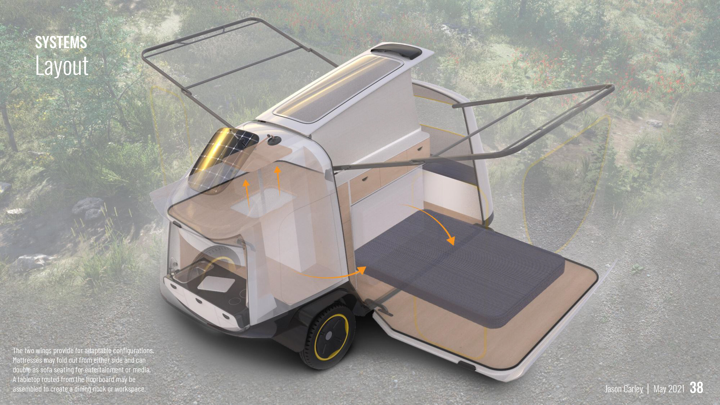
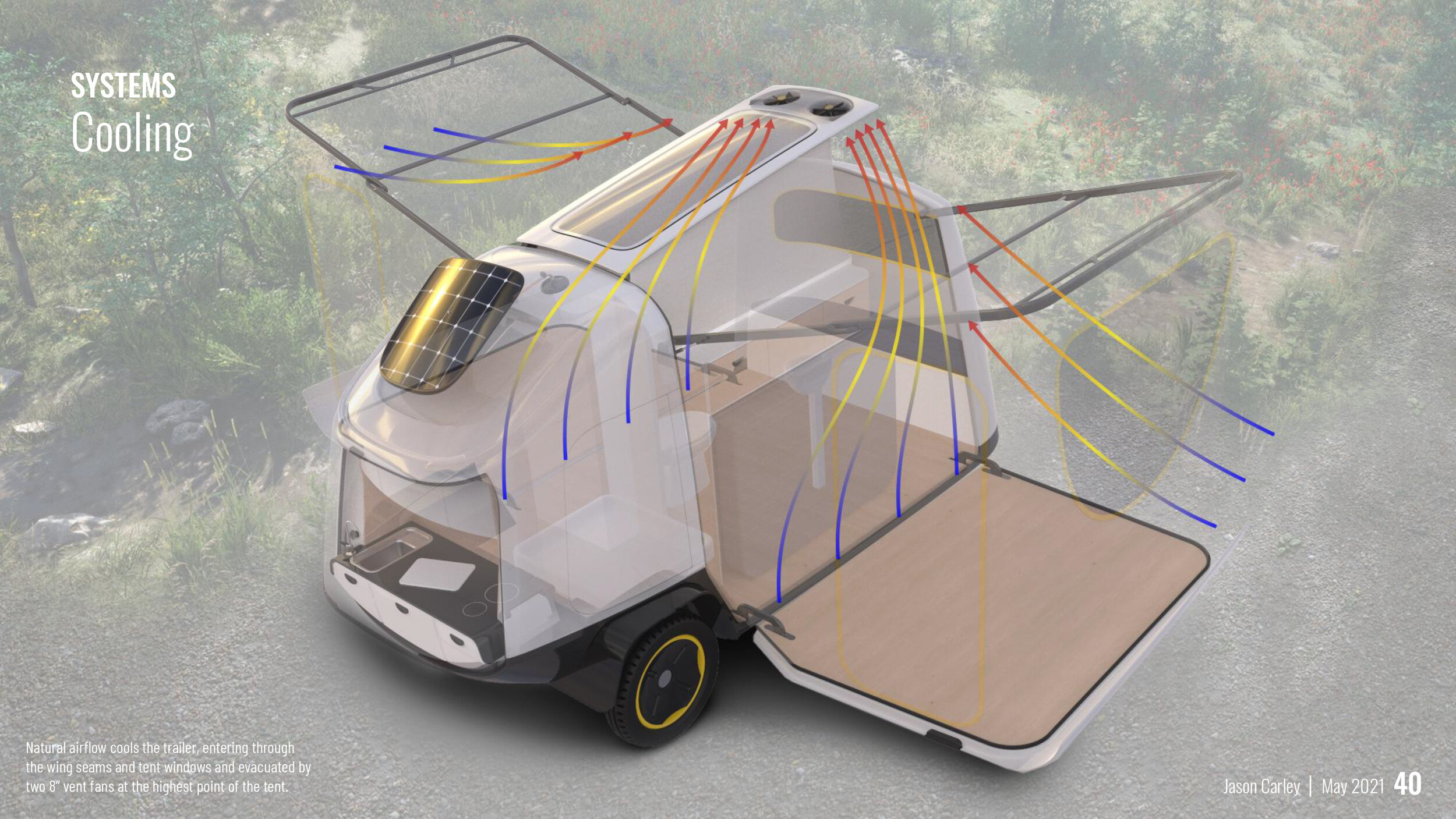
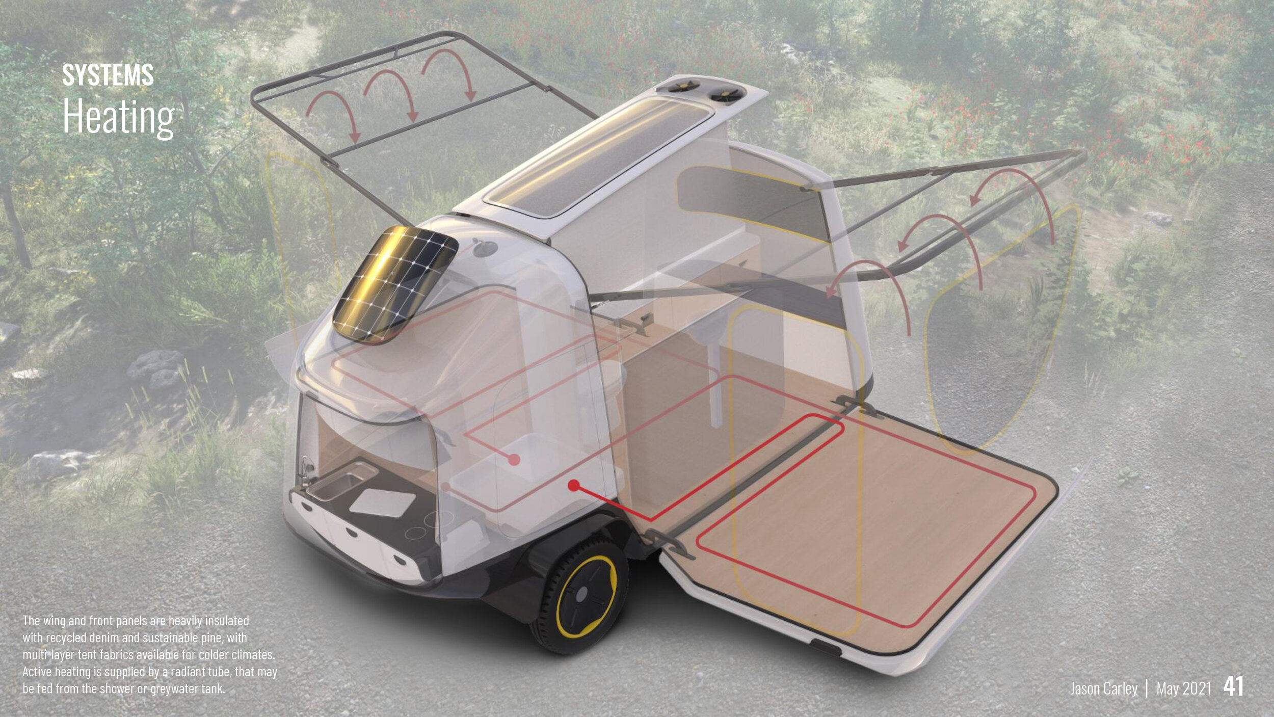
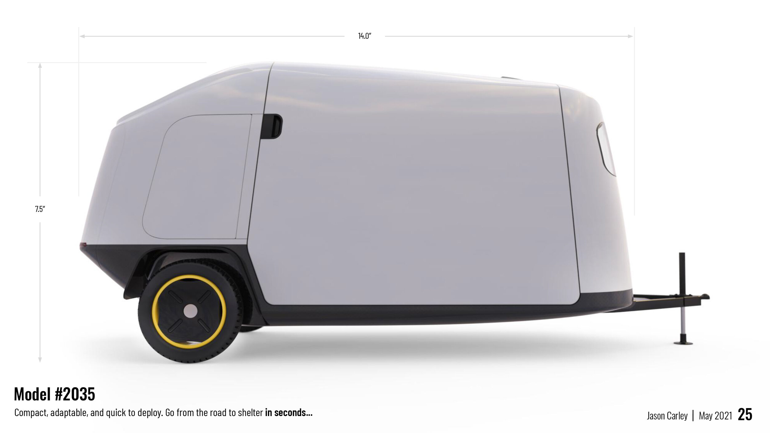
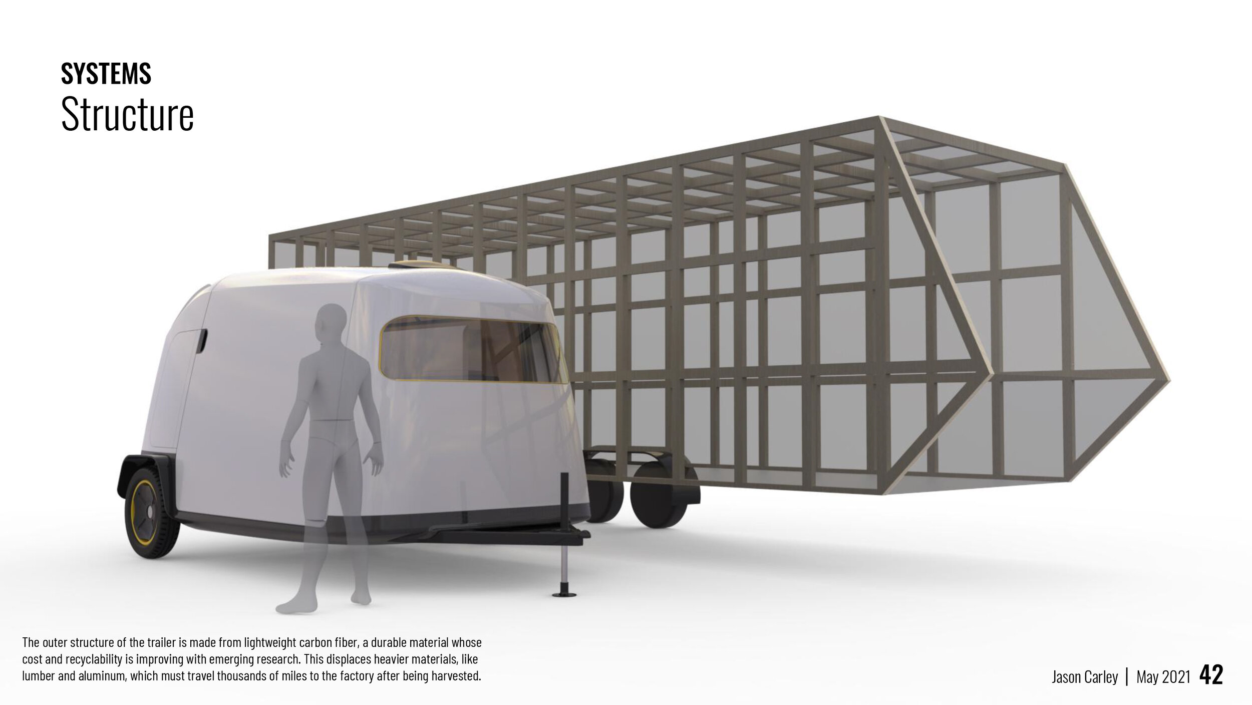
This project proposes a design for a near-future towable trailer that loves nature back. It targets a younger, more urban customer than the traditional RV industry, providing an accessible outdoor retreat and escape from high-consumption behaviors. It has been designed for rapid setup / takedown, resource stewardship, and low environmental impact.
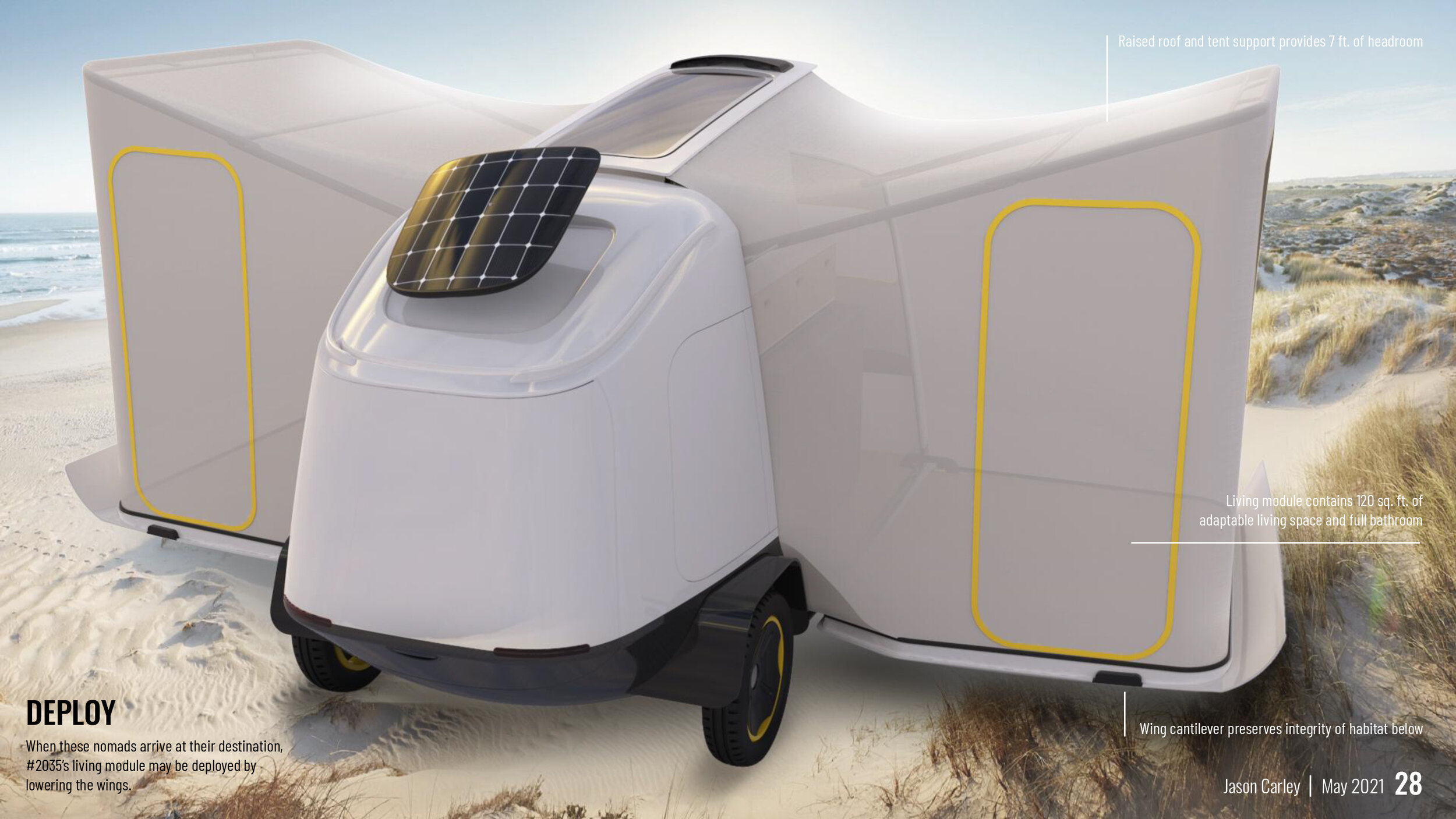
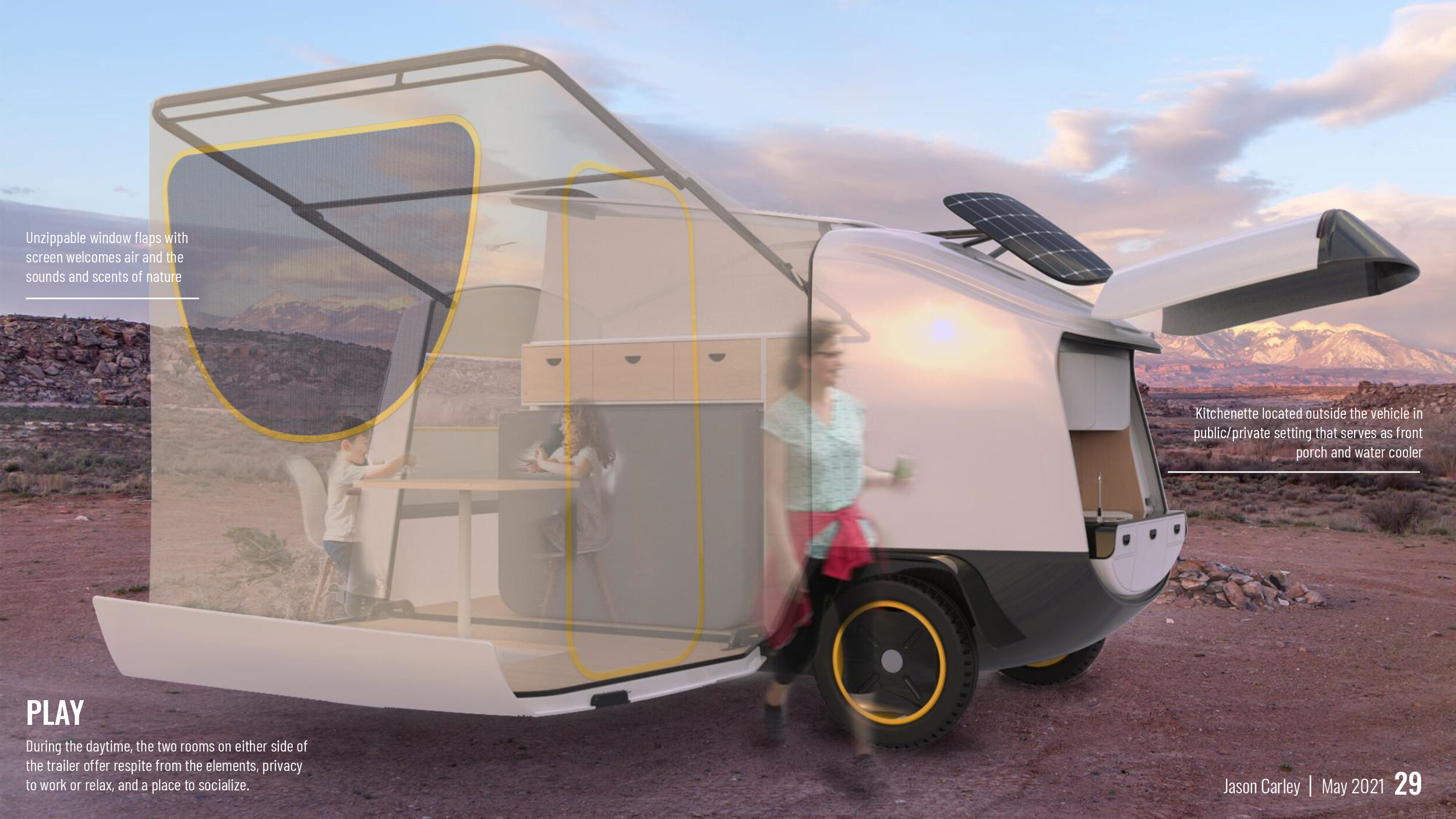
In the following storyboard, I invite you to join these Nomads on one of their journeys with Model #2035.


Research and Process

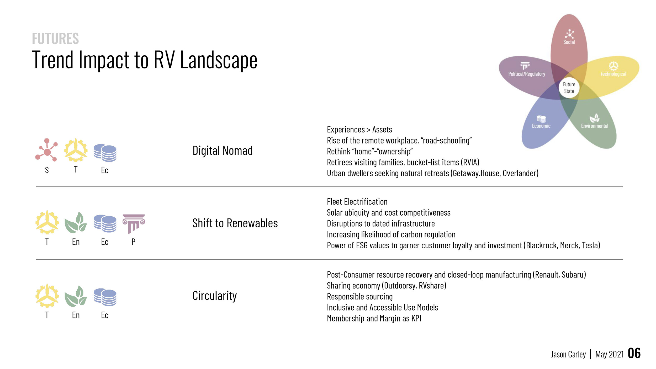
To recap a short excerpt from my research, I used a futurecasting framework to look at trends impacting transportation and architecture in the United States. Three themes emerged.

Improved wireless networks and shifting workplace norms have given rise to the digital nomad, a growing trend among young creatives, roadschooling parents, and retirees, even before its acceleration due to COVID. Second, the increasing likelihood of carbon regulation, international competition and public pressure will speed the transition to renewable energy. Thirdly, as a means to retain customer loyalty and spur investment, architects, manufacturers, and developers will need to continually improve their footprints, recovering resources and closing the loop in their production cycles.

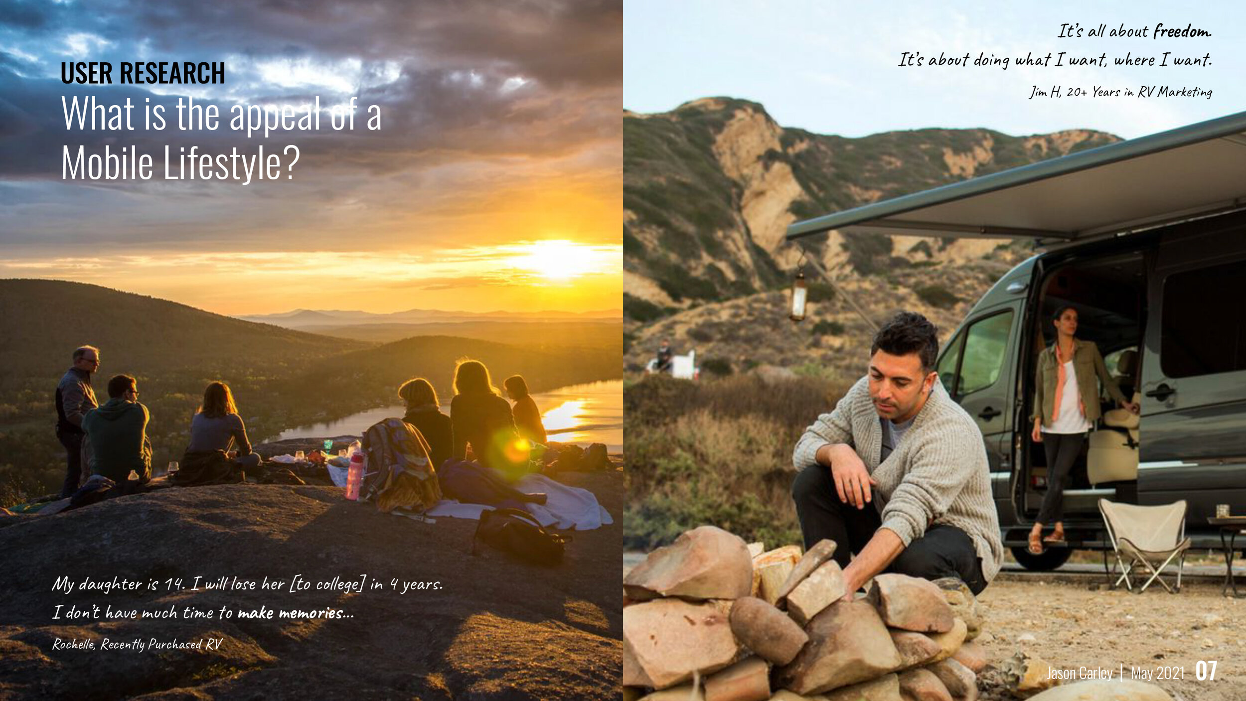
I spent the month of March using a variety of research methods, including lit reviews, media from online experts and influencers, and various frameworks for benchmarking trends and on-the-market products. In parallel, I conducted user research with several RV owners and industry professionals. Two themes that surfaced was the desire to make memories, acutely understood by parents with young children. The other in the universal American passion for freedom - which filters into attitudes on travel, education, sense of place, and economics.

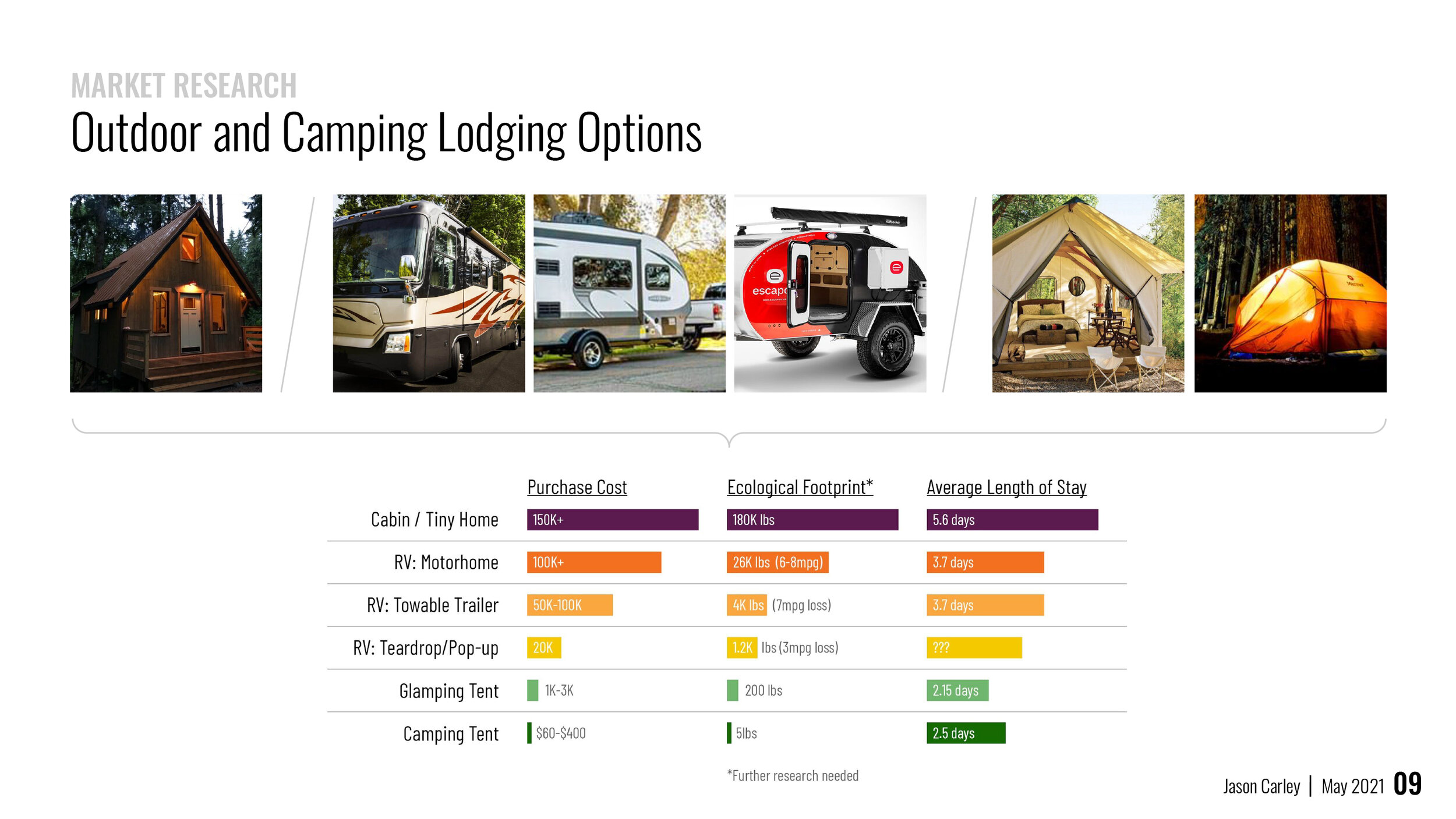
To guide my research into the market landscape, I catalogued the six primary shelters for outdoor lodging to see how they compared in financial and environmental costs, and also to get a sense for how long a typical stay they afforded. 

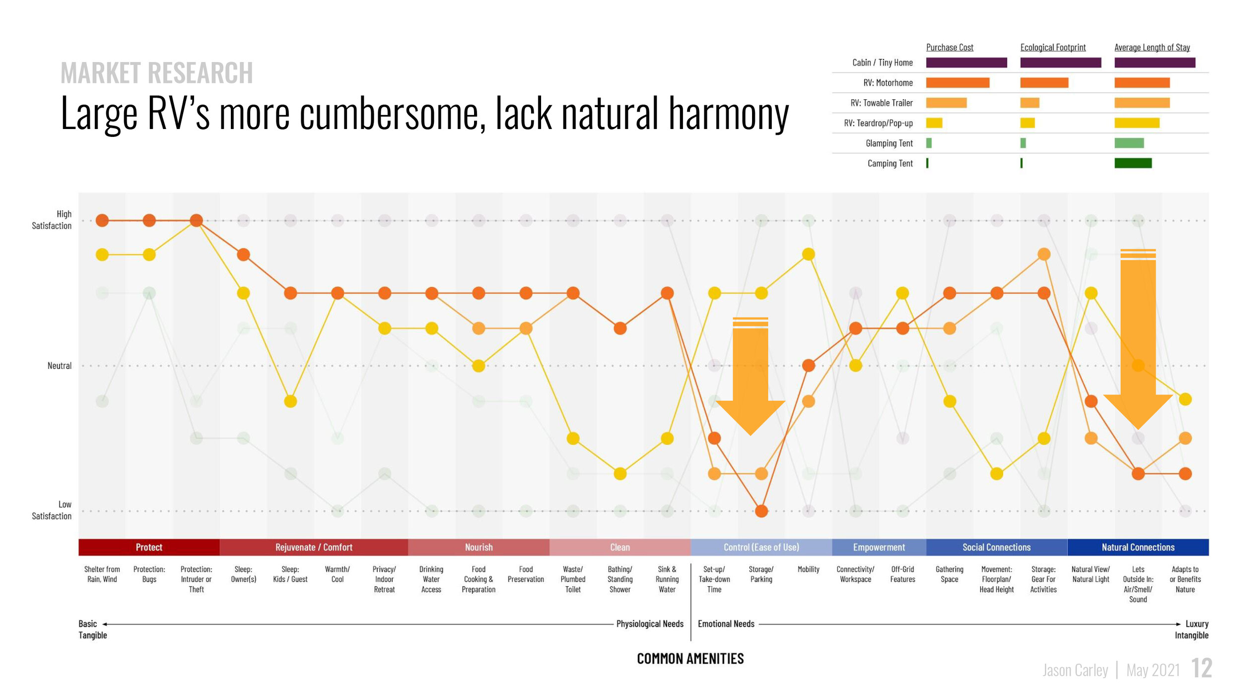
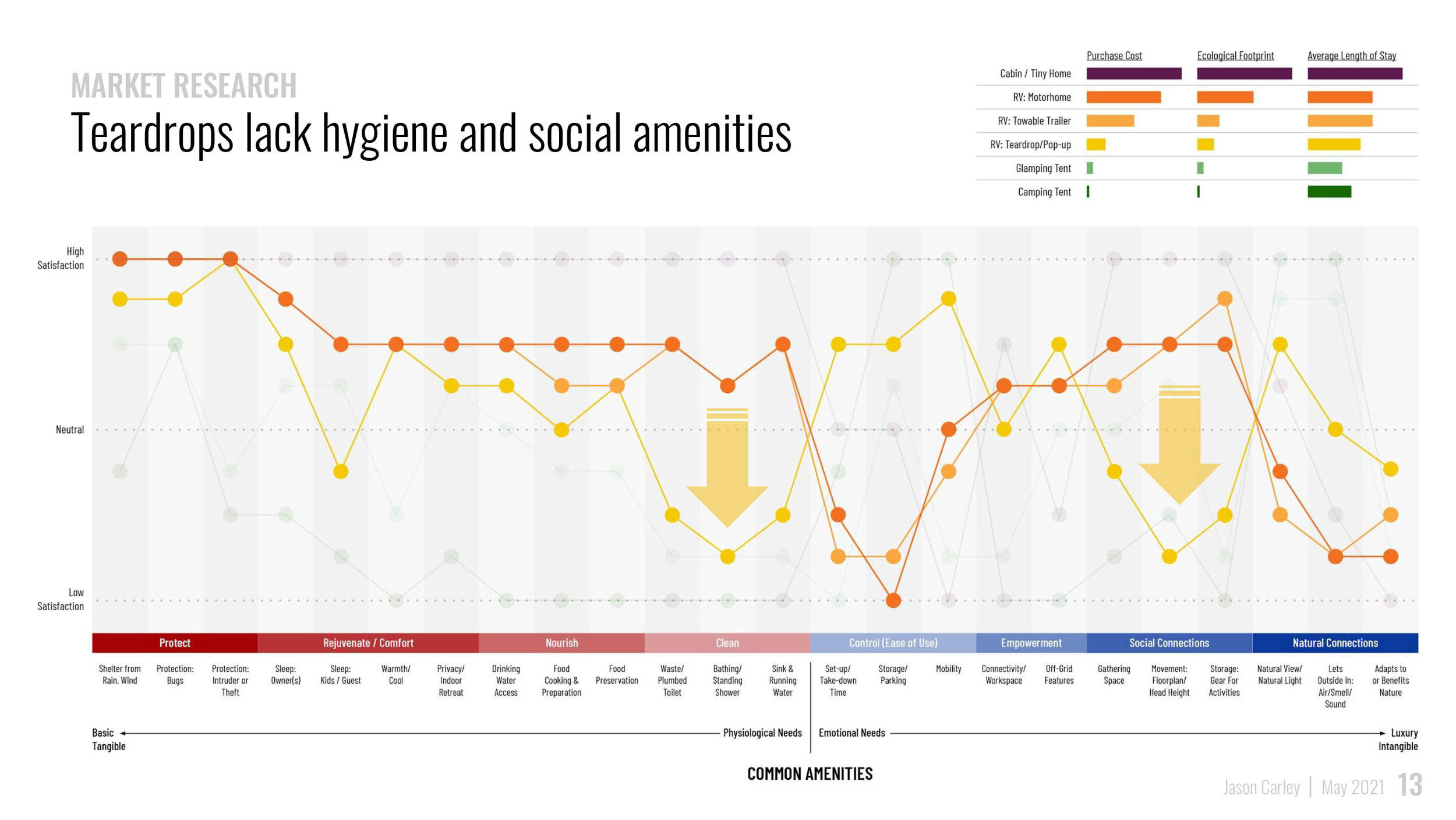
I then mapped their common amenities on the degree of satisfaction among users. High satisfaction or variety in offerings charts highly, neutral means it is not expected or average, and low satisfaction means the quality is poor or the amenity nonexistent. The amenities loosely correlated to basic or physiological needs on the left (buckets like protection and comfort) and more emotional or aspiration needs on the right, like contributors to feelings of empowerment, social bonding or natural harmony. 

This analysis presented a few themes, that cabins, while enormously costly, require little adaptation and training to use. Large RV’s are the most cumbersome and difficult to use, and can affect a sterile environment devoid of natural connection. While easier to use and more mobile, teardrops lack the space for plumbing, basic hygiene, rejuvenation and entertaining. While tents are cheap and have low environmental impact, they fail to satisfy many of our basic needs. However, they do allow for a profound natural experience.

All of this research led me to wonder whether there might be some fertile middle ground. Could a more compelling approach to creature comforts bring out people who don’t camp? Can the RV footprint be reduced while providing better natural connections? And could options for hygiene and socializing be expanded for teardrop trailers?

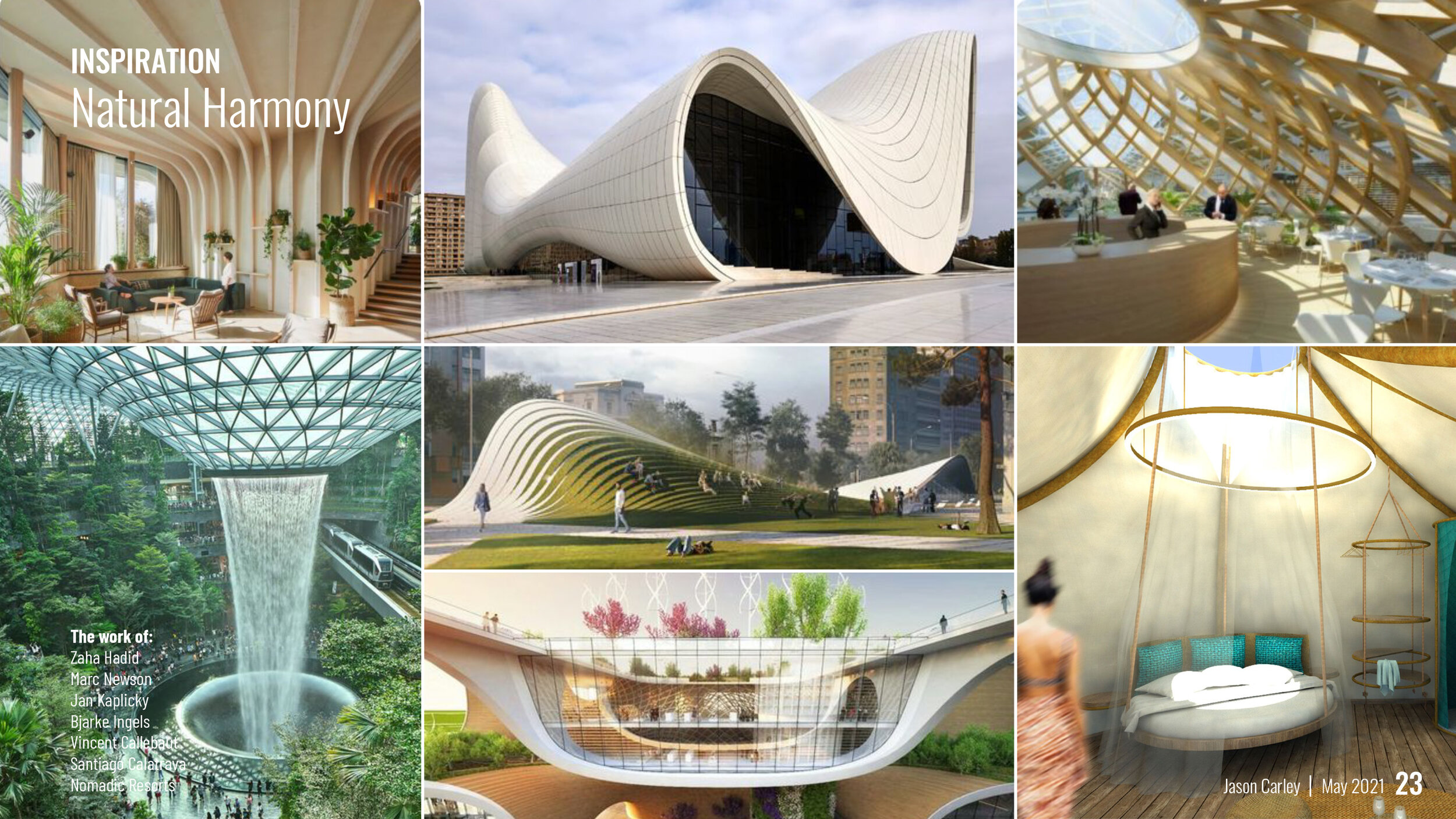
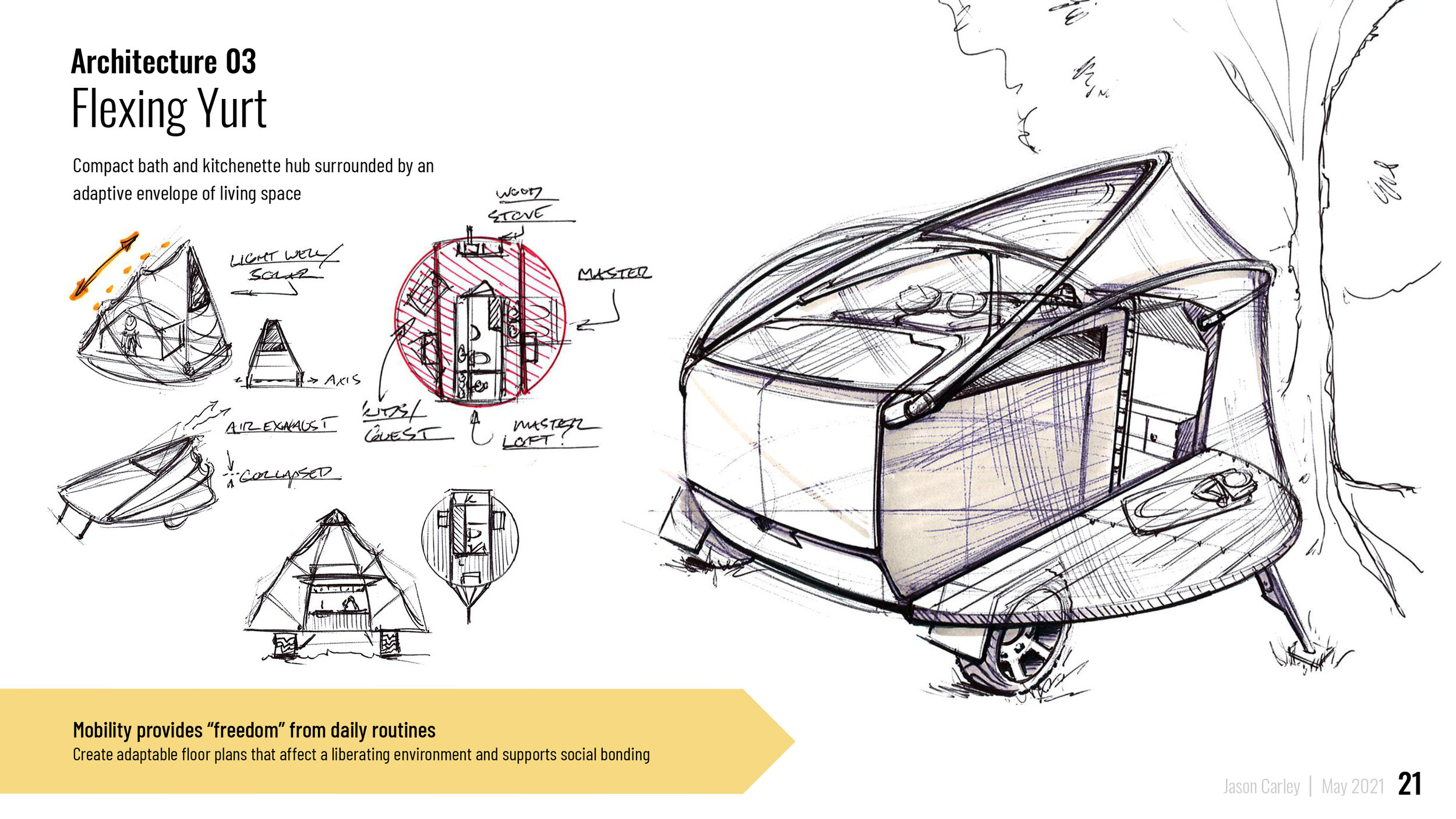
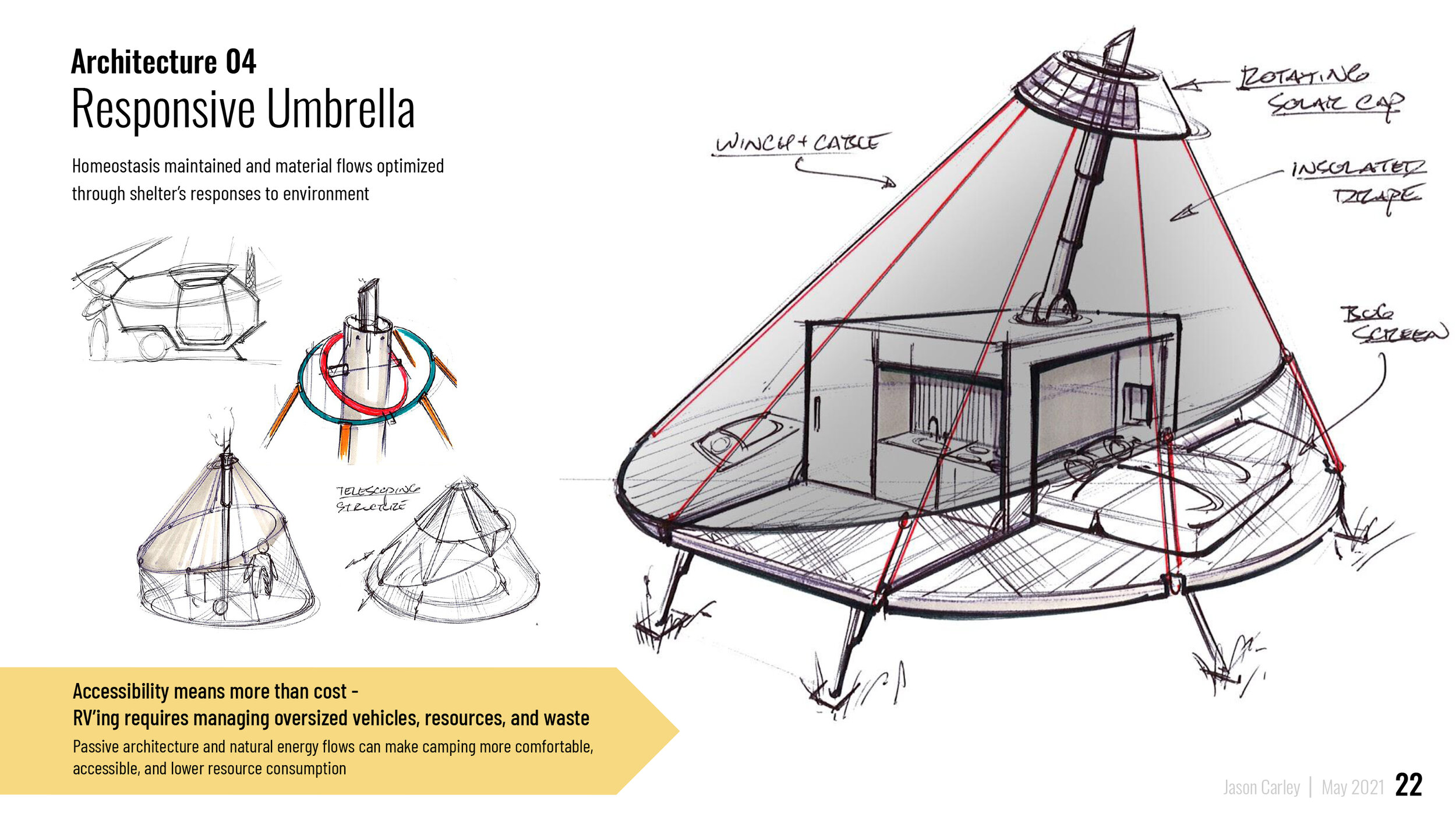
Inspired by the work of futurist architects like Zaha Hadid and Bjarke Ingels, among others, I began to explore forms that mimicked nature in their function and construction, to enable a mode of living that harmonized with the landscape and its elements.

Choice Architects, Behavioral Nudges, and.....UX?

One of the joys of reading is when you’re able to make an unexpected connection between what’s on the page and what’s going on around you.

I’ve been reading the book “Nudge” by the economist Richard Thaler, and am finding a wealth of parallels between his human-centered approach to behavioral economics and user-centered design. Thaler posits that rather than think of humans as predictable actors governed by logic, they are rather “subject to their own frailties” - meaning that they often act illogically, influenced by emotion, impulse, internal and external pressures. This echoes the preference user-centered design has for observation over interviews and Simon Sinek’s inside-out approach to branding.

Many of us, either through our work or family relationships, are what Thaler calls “choice architects”. These are people that are responsible for presenting options for which others must choose (think parents, merchandisers, or financial advisers). Knowing that humans are thus subject to our own shortcomings, an ethical choice architect has a responsibility to help “nudge” a decision-maker to a desired outcome. For example, picking a healthy meal option or saving for retirement. A nudge refers to subtle manipulations of how (and when) the choices are presented to increase the likelihood that a customer will make the choice that does them the most good.

It is quite a short mental leap to classify designers as choice architects, whether you state our role in marketing, branding, or user-experience. While reading “Nudge”, I’ve been working on a UIUX project and I found myself thinking about nudging users via button placement, color selection, menu types, etc. “How can I help them get it right?” By minimizing a user’s opportunity to err, I could better ensure they reach the end of the flow and achieve an objective. In addition to digital applications, I can see this bring hugely important in service design and business ops.

Beyond just adding a few new terms to my vocabulary, Thaler’s concepts have provided a fascinating take on understanding, guiding, and designing for users in all of their complexities.

Healthy Critiques - The Golden Rule

We were treated to a surprise visit recently by one of our old classmates at college, and while catching up, had a wonderful conversation about design critiques. It served as a great refresher and a reminder that no matter how much we think we learn over the years, the basics are often a challenge to master.

Our guest brought up the “Golden Rule” of design critiques (the one that every freshman designer learns their first semester) which goes something like - don’t say that you like a piece or dislike a piece, explain that it “works” or “does not work”, because…X, Y, and Z. This trains a young designer to take the subjectivity out of a critique and focus on external factors, i.e. the user experience, intended audience, product requirements, inspiration, environment, client/brand values, etc. For example, “the choice of a metallized logo-plate ‘works’ here because of the brand’s industrial and premium aesthetic.” As, or perhaps more importantly, it begins a dialogue through which the originator may respond with their rationale, fostering healthy discussion.

It is so easy, among professionals, to forget this lesson and fail to make time for healthy dialogue within a team. When times get busy, I find that my teammates and I tend to zero-in on our own projects and don’t make the time to elicit feedback internally through this very simple exercise. The benefits are numerous. First, it challenges you to explain and defend a concept, making it easier to understand whether “it works” or whether its beauty is skin-deep. Multiple perspectives are a necessity for this. Secondly, and quite obviously, it improves the quality of the work. It allows for more iteration, more feedback, divergent ideas, and challenges the originator to refine. Lastly, I think it psychologically shares the feeling of ownership attributed to a piece. As a concept evolves to capture the feedback of the full team, each teammate may see their ideas embodied in some form. Thus, a final concept becomes less the victory of one creator and more of a win the whole team can participate in.  

Discussing this basic technique brought back many fond memories of old classmates, projects, and the collaborative culture we had back in college. I will be making an effort to bring more of this style of dialogue into our studio and am sure that it will lead to some great design.

Why Write?

It's a question that I had grappled with continuously throughout my time in college. Being so much more engaged in my design and engineering coursework, I would put quite literally anything before getting around to writing papers. Time and time again, I could be found hunched over a desk in a study carrel the night before a due date, hastily spilling the contents of my exhausted brain into barely conceivable, double-spaced lines.

As I've gotten older, the animosity I had for the "liberal arts" side of my education has ebbed and transitioned into something more akin to reluctant gratitude. I've found that the act of writing is an opportunity to make sense of the vast amount of disparate information we take in on a daily basis. In a world that spins ever faster and with vast oceans of information at our fingertips, writing requires us to clear our minds for a brief moment and try to connect the dots. 

A Sensei of mine from years past used to say that "you don't really know something until you have to teach it", underscoring that earning a black belt is not the end of learning, but rather the beginning. I've found that writing functions much the same way. In this spirit, I am kicking off a personal campaign to write more - to make sense of what inspires me, puzzles me, and challenges me. To learn...and hopefully, at least a little...to teach.

Ergonomics in Session: Presentation to Marquette and the Milwaukee Institute of Art and Design

_IMG_3237.JPG

In November I had the privilege of presenting to Marquette and the Milwaukee Institute of Art and Design’s first crop of “Da Vinci” students. Along with an engineer from Shur-line, John Jacobson, we shared experiences that prove that when design and engineering work together, products can be infused with outstanding user experiences at prices that won't break the bank.

The “Da Vinci” course is an innovative new program that brings together Mechanical Engineers from Marquette with Industrial Designers from MIAD to collaborate on projects. Led by Professors Richard Marklin, P.H.D. and Mark Nagurka, P.H.D., it is an opportunity for these two groups of students to work together long before arriving at their first day on the job. With Professor Marklin’s deep expertise in the field of ergonomics, he knew that Shur-line’s products would make excellent case studies for these product development trainees.

_DSCN1707.JPG

John and I have worked together over the last twelve months on several products that focus on bringing superior ergonomics to painting. Our goal has always been to empower the Do-It-Yourselfer with tools that give professional results. Armed with insights derived from user research and product testing, our collaboration led to the creation of new tool platforms, a redefinition of the visual brand language, and a good deal of engineering and manufacturing ingenuity.

_IMG_3239.JPG

During our presentation, we shared many of challenges we overcame on bringing these products to market and how designers and engineers can combine their unique perspectives to create immense value for both the Customer and the Brand.